Navigating Around Crafter Studio
Projects
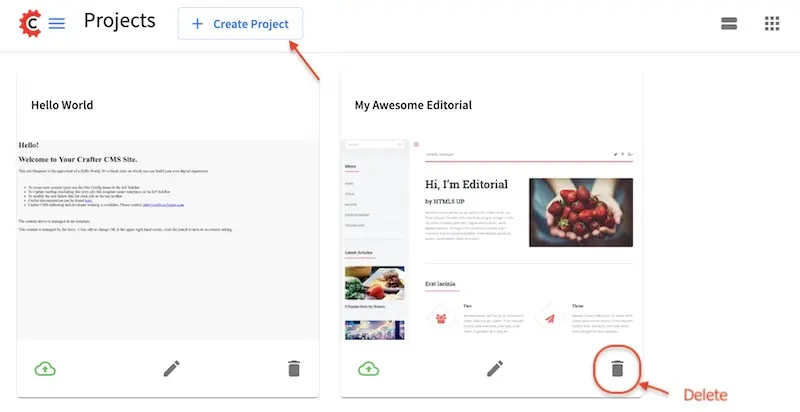
Projects is the first screen you will encounter after logging in to Crafter Studio. This screen lists all of the projects you have been granted permission to. From this screen you can navigate to any project. Your projects can be viewed either in a list or in a grid.
Here’s the Projects screen with the projects in a list:
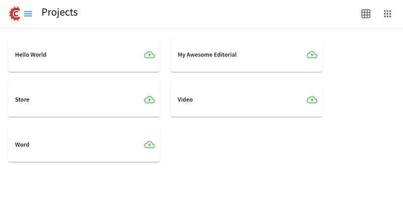
Here’s the Projects screen with the projects in a grid:
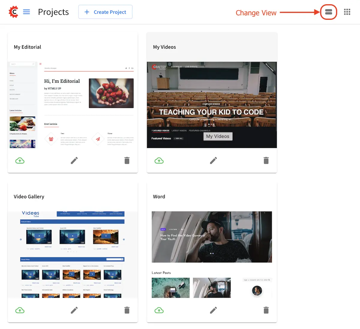
- You can get back to the Projects screen by:
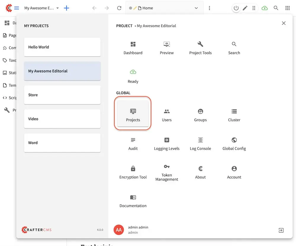
Clicking on the
Navigation Menuicon at the top right corner, then click on “Projects” on the top left of the Global panel
Projects (Admin)
Crafter Studio administrators can also create and delete projects from this screen.
Account Management
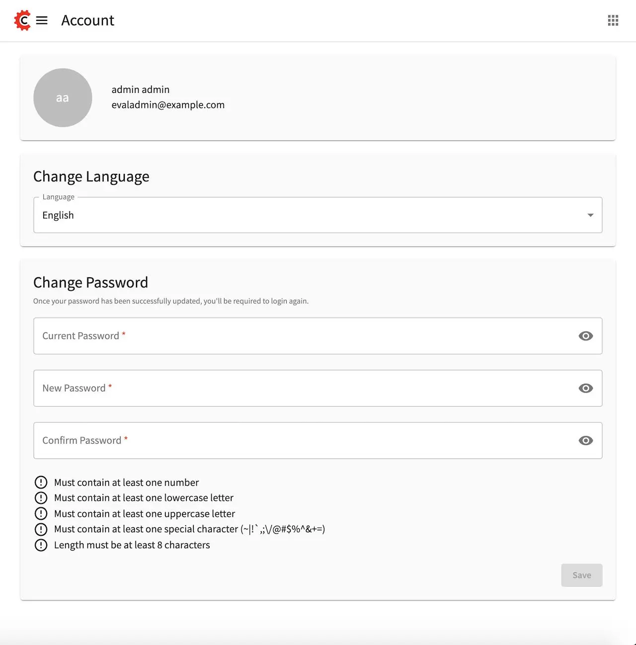
Account Management is where you go to change your personal Crafter Studio settings like language or to change your password.
- To get to Account Management:
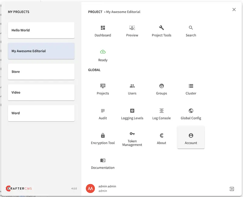
Click on the
Navigation Menuicon at the top right cornerClick on Account under Global
Project Dashboard
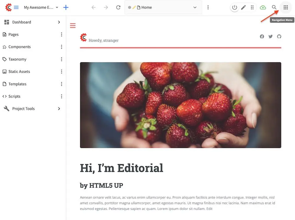
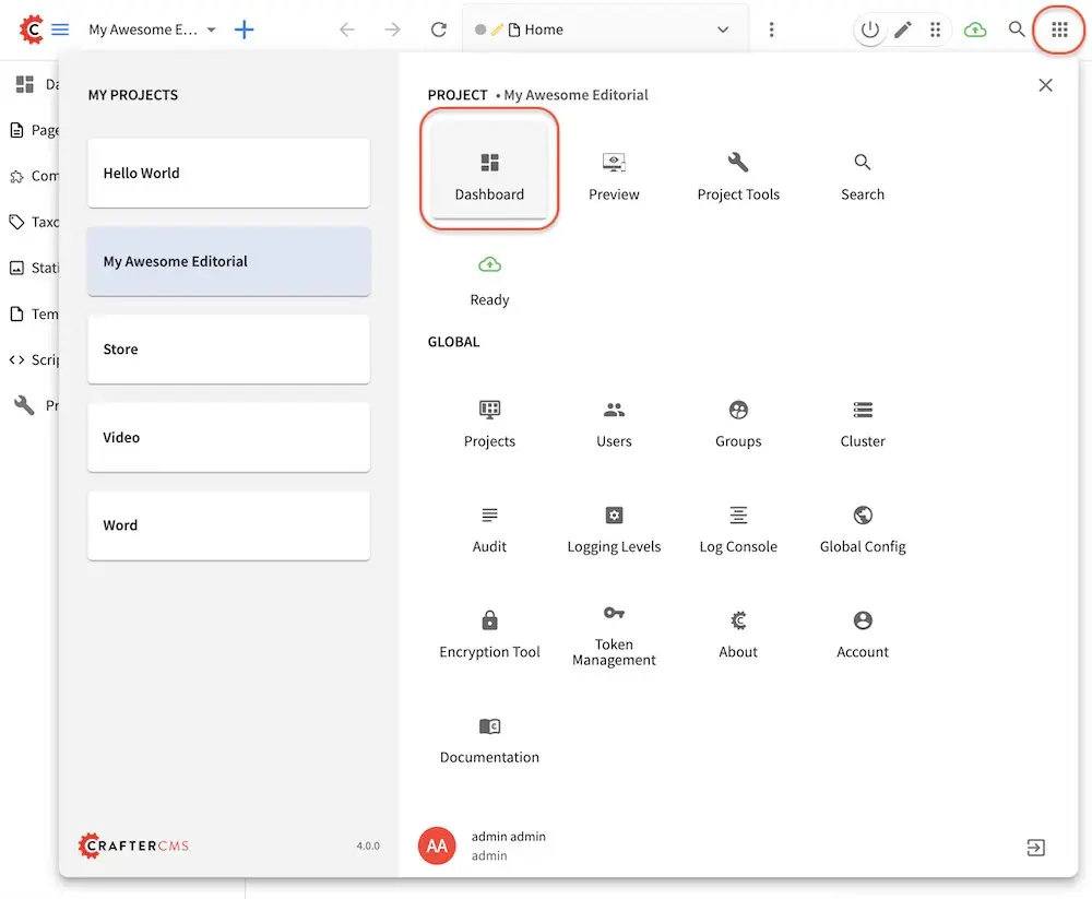
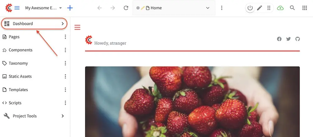
Each project has a Project Dashboard. To view a project’s dashboard, click on the Navigation Menu icon at the top right corner of the screen, or click on Dashboard at the top of the Sidebar.
Access the Dashboard from the Navigation Menu
Access the Dashboard from the Sidebar
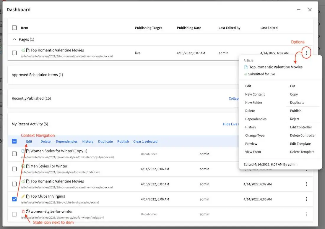
This screen is an overview of the workflow for that given project. The project dashboard has different widgets depending on your role.
Each dashboard has a header
Expand Collapse control. Each widget can be closed and opened to hide the items shown by the widget. This setting is remembered by your browser
Dashlet title and count. Most dashlets include a count at the end of the name for the number of items in the widget
Dashlet level options. Options are different on each widget
Show count. Some dashlets allow the author to decide how many items they want to see in the dashlet
Content “type” filter: Some dashlets allow you to filter them by a broad content type (All, Pages, Components)
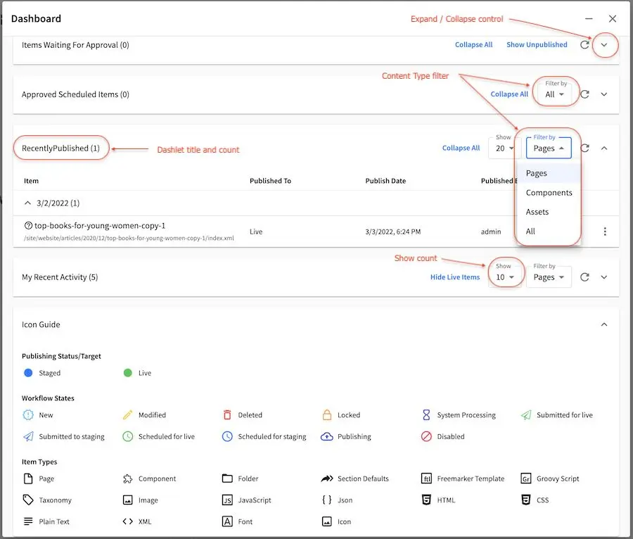
For the dashboard shown above, here are the dashlets listed:
- Items Waiting for Approval
Shows all items currently in workflow
Viewable only to admins and publishers
- Approved Scheduled Items
Shows all items approved for a specific scheduled deployment date
Viewable only to admins and publishers
- Recently Published
Shows all items that have been previously deployed
Viewable only to admins and publishers
- My Recent Activity
Shows all items recently modified by the current user
Viewable by all users
- Icon Guide
The Icon guide is simply a legend to help authors and content managers with the iconography on the system. While it can be very complex to sum up the state and nature of content in a glance, Crafter Studio attempts to achieve a high level visual summary for each object icons. You will see these icons throughout the application whenever an object is presented to the user. The icon always shows the Current state of the object.
Describes the meaning of icons within Crafter Studio
Viewable by all users
The Icon guide breaks down icons in to their elements. You have two basic elements which can be combined to form a specific icon: the item type and the worfkflow indicator.
Item Types
Item types are high level archetypes of content objects within the system. These types and the iconography associated with them provide a basic classification of the type of object at a glance.
: A page is exactly what you would expect, it’s a URI addressable object that represents a web page or resource.
: A component is an object that is generally not URI addressable on the project. Examples are objects like Banners, Touts, Sidebar content etc. Components are usually re-usable assets that can be assigned and shared across many pages.
: A taxonomy is an object the same as a component used for classifying items.
Below is a list of all the other item types available:
Workflow States
Workflow States help authors and content managers understand at a glance what is going on with the content at a high level. Is it Live? Is it work in progress? Is it currently checked out? In some sort of approval process?
: The content has never been pushed live. This helps authors quickly identify which objects that are in progress are already live and which ones are entirely new.
: Edited means that the item has been edited since it was made live. Items move to edited as soon as they are created or when they are edited.
: Items which carry the red trash can icon but are not editable and previewable are deleted. You will only see these items in dashboards which show historical data
: A locked item is currently in the process of being edited by another author.
: Item is currently being handled by the system
:
: Any item which carries the airplane icon is in some sort of workflow
:
: Item has a launch schedule associated with it
: Item is currently being published
: You will find that some objects have a red circle with a slash in the middle, this means that the object is not deleted but it should not be displayed on the project. It’s essentially a logical delete. Imagine a scenario where you need to take an object down immediately because of an inaccuracy while you make corrections. Disable is perfect for this and several other scenarios.
Publishing Status/Target
: Item has been published to the
stagingpublishing target
: Item has been published to the
livepublishing targetSelecting a dashboard item
Dashboard items have the ability to be selected. Selecting an item allows the user to interact with the selected items via the context navigation
Items in the dashboard has a icons which shows the type and current workflow status of the item
Clicking on
Options(the three dots next to the item) shows the type and current workflow status of the item, plus all options available e.g.Edit,Publish, etc.
Preview
Every project has a preview. This allows users to see, edit and test the project in a safe authoring sandbox prior to publishing changes.
Preview is a fully functional project but in a safe-to-edit environment.
The top center shows workflow status and options (three dots) for the current page
Author can change the type of preview from one channel to another
Author can turn on in-context and drag and drop editing features
Author can change the targeting attributes used to view the project
Author can view the publish status of the project
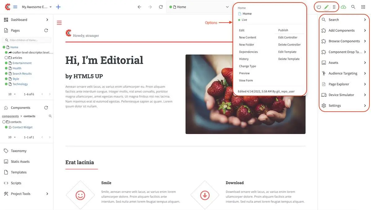
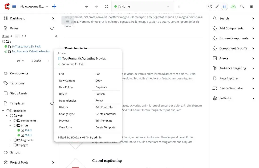
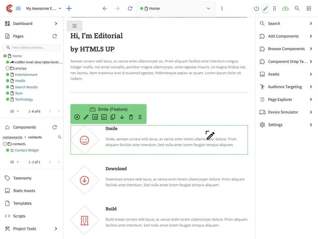
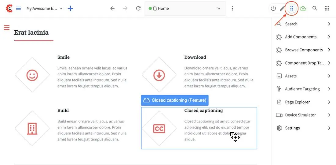
Experience Builder Panel
When in preview mode your context navigation will show an additional control beside the publishing status.
The
Edit ModeandMove modeicons turns on the Experience Builder panel which allows you to use in-context editing and various tools for creating your page in a panel on the right
Searchallows you to search for items such as components, images, etc. in your project
Componentsallows you to create a component and also lists all available components in your project which can then be dragged and dropped into your page
Browse Componentsallows you to browse for components which can then be dragged and dropped into your page
Component Drop Targetsallows you to select a content type, which then shows you the drag and drop area for that content type
Assetsallows you to search/list assets such as images in the project
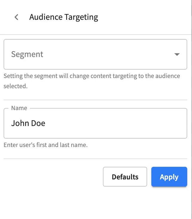
Audience Targetingallows you to view and set targeting attributes for the project.
Page Explorerallows you to browse/list pages in the project
Device Simulatorallows you to change the type of preview from one device to another e.g. phone to tablet
Settingsallows you to turns on/off in-context editing and setup highlighting of drop zones
In-Context Editing
When in-context editing is turned on (Edit mode pencil is green or Move mode two vertical ellipsis is blue at the top), it puts the page in construction mode. When you hover your mouse around regions of the page that have been wired for in-context editing, a pencil will show up instead of the mouse cursor.
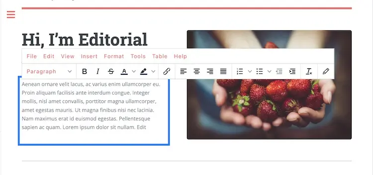
This pencil allows you to edit the content of the wired region, including the current page’s template and controller depending on your user account permissions
To turn off in-context editing, click on the Switch off editing off switch icon at the top, which will then turn the Edit mode/Move mode icon to gray.
Convenient keyboard shortcuts are also provided, press ? to see the list of commands.
Search
The Search tool allows you to search for components and static assets in the project then display the results from which the user can drag and drop into the current page being viewed if there are configured drop targets in it
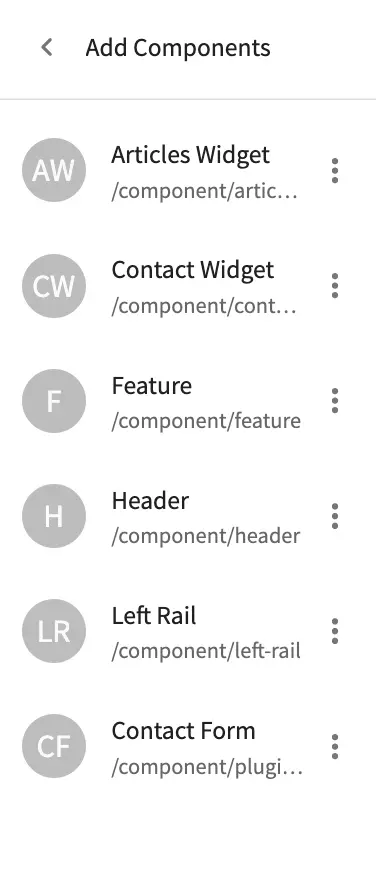
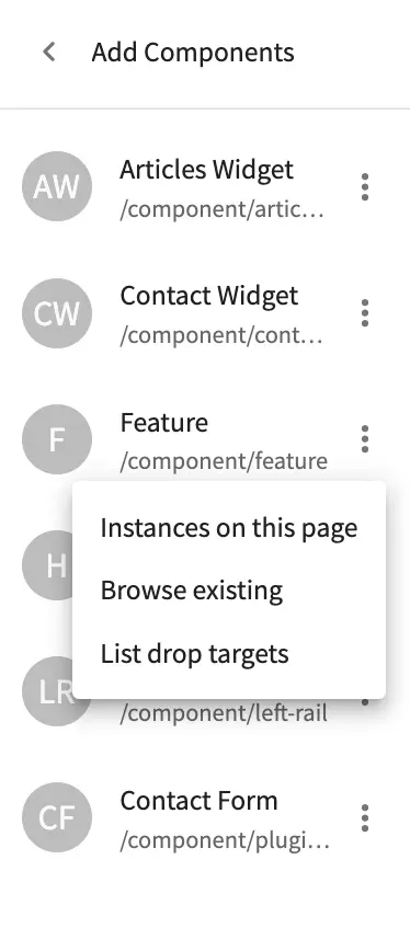
Add Components
The Add Components tool allows you to create new components by dragging components from the panel and on to the screen to configured drop targets. A new component with default values will then be visible and ready for editing when a new component is dropped on the screen.

You may drag around a component from one position to a different position by enabling the Move mode (by clicking the Move mode icon at the top right, or by using the keyboard shortcut).
Crafter Studio administrators can configure what components are available in this panel.
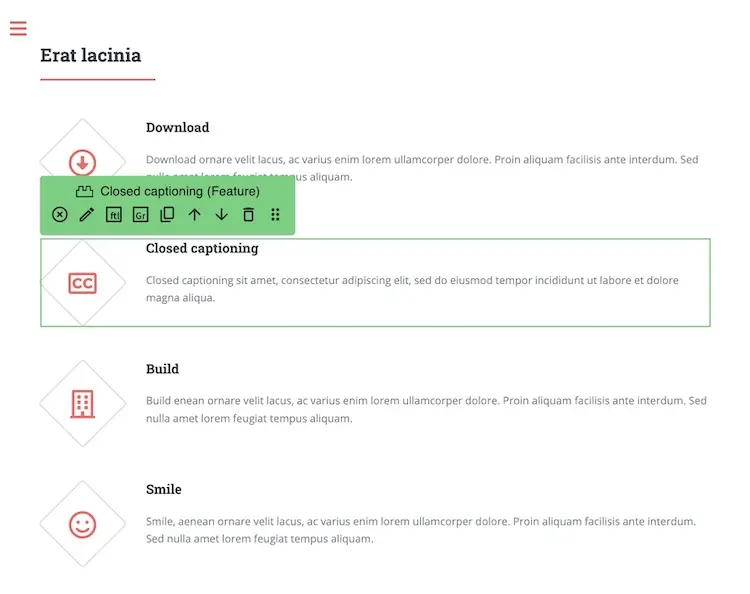
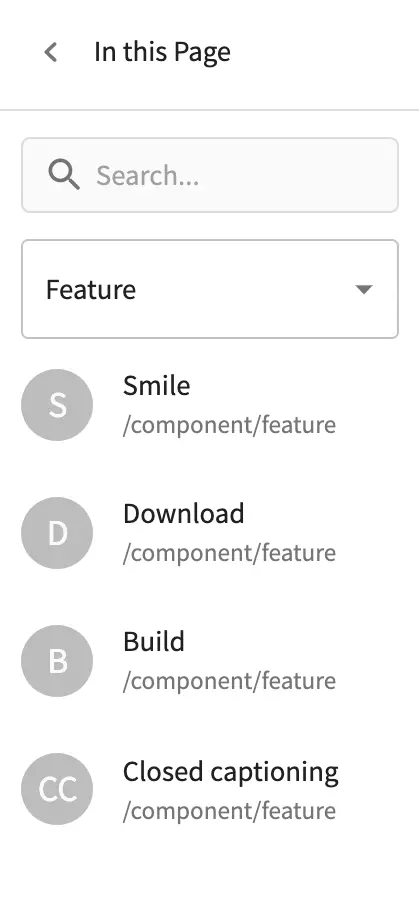
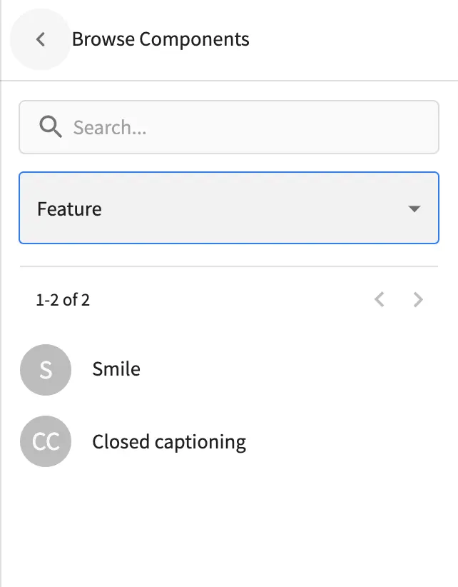
Browse Components
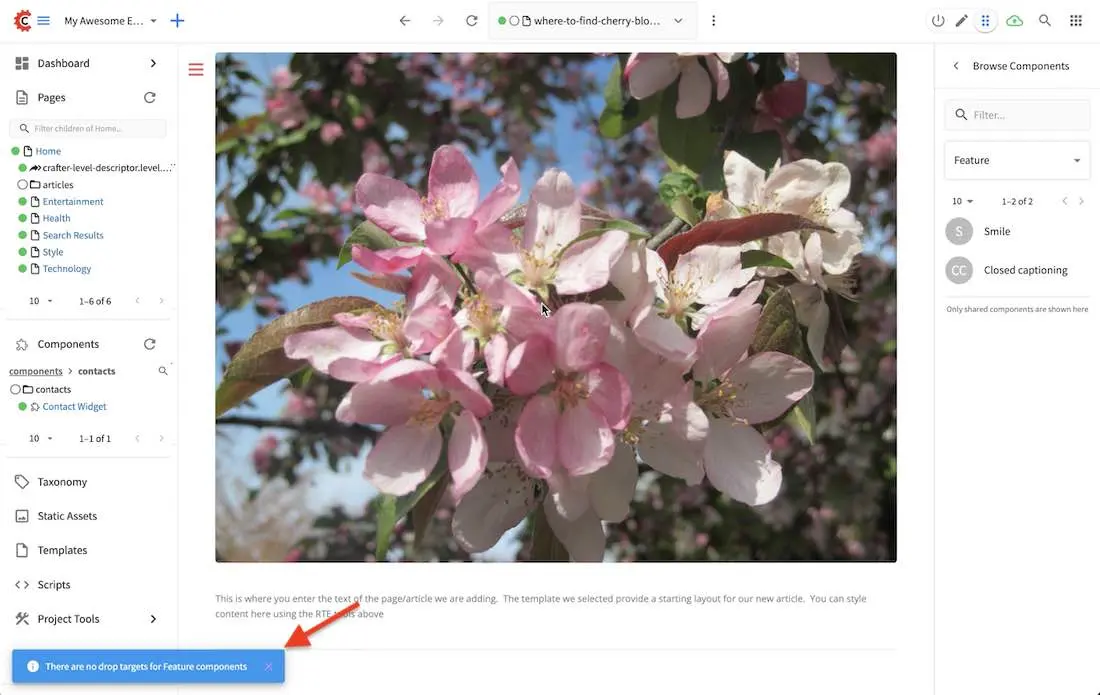
The Browse Components tool allows you to search / select a content type in the project then display the existing components for that content type that can be dragged and dropped into the current page being viewed if there are configured drop targets in it
When you drag a component into the page being previewed and there are no drop zones configured in the page, you will see a snack bar like below:
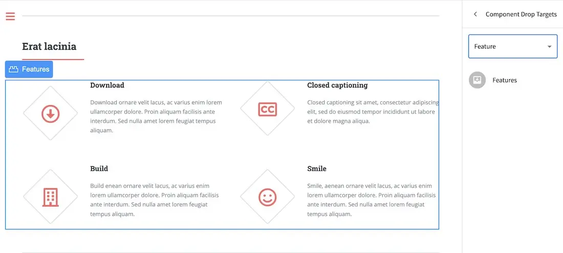
Component Drop Targets
The Component Drop Targets tool allows you to select a content type in the project then display the configured drop target for that content type on the current page being previewed
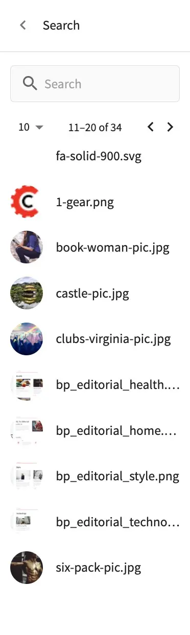
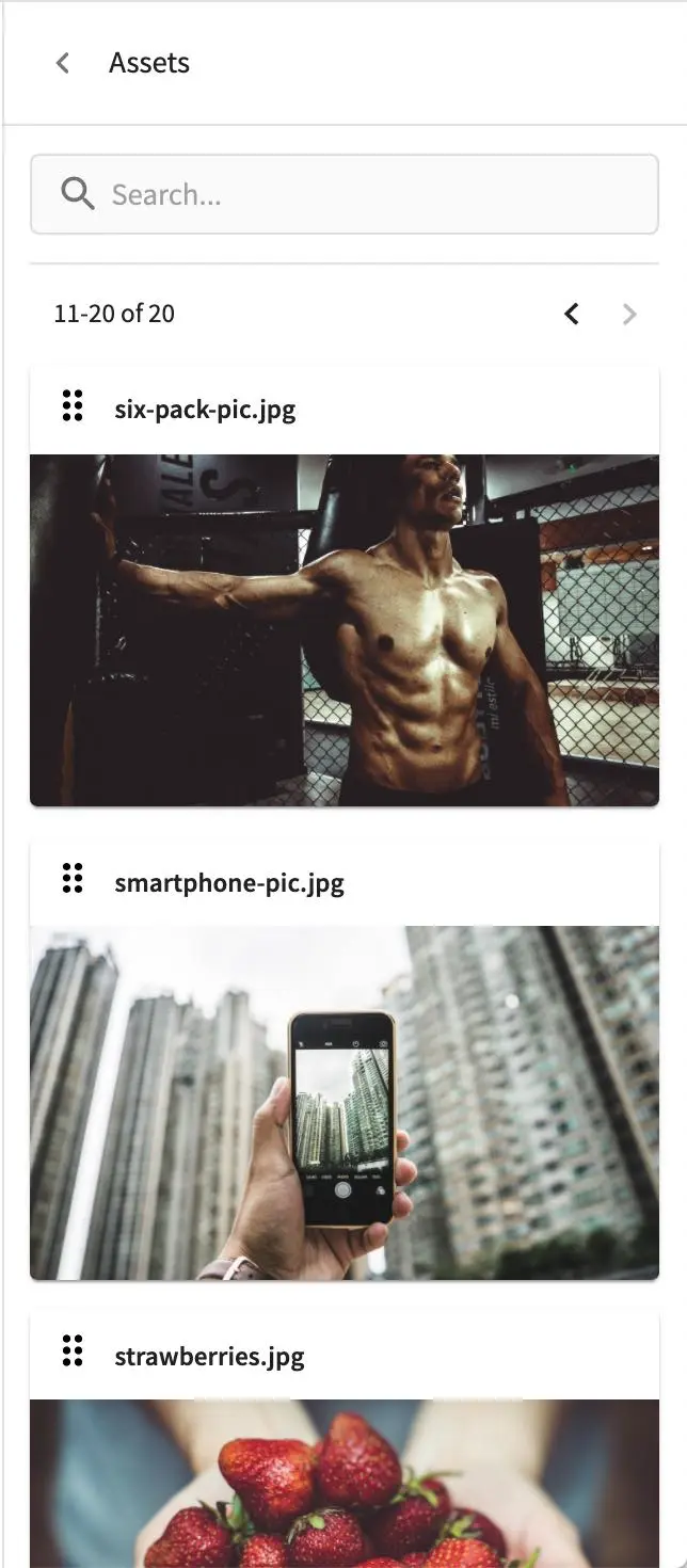
Assets
The Assets tool allows you to search/list assets such as images that can be dragged into configured drop targets in the project
Audience Targeting
The Audience Targeting tool allows you to view and set targeting attributes for the project
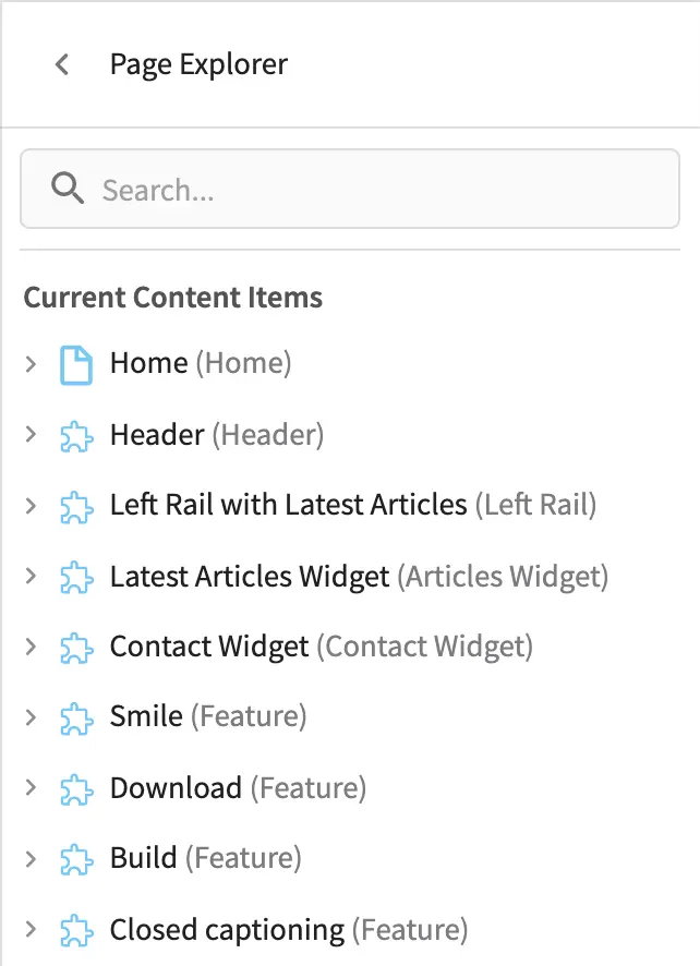
Page Explorer
The Page Explorer tool allows you to browse/list content items such as pages, components and level descriptors in the project and make edits to them by clicking on the three dots next to the content item that appears when you hover your mouse on it
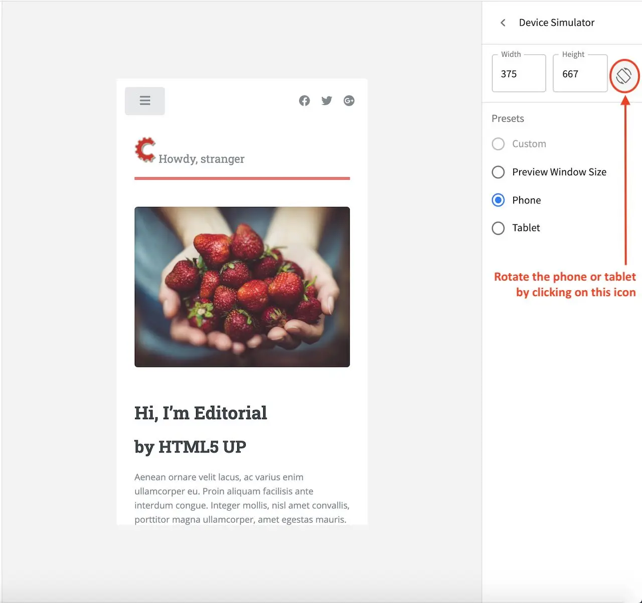
Device Simulator
The Device Simulator tool allows an author to review the current page in the context of all devices supported by the project.
The phone and tablet can be rotated through the use of the rotation control next to the width and height input boxes.
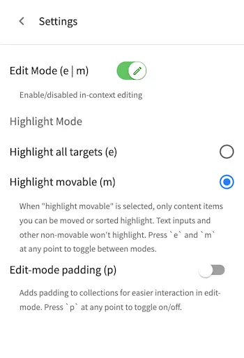
Settings
The Settings tool allows you to switch on/off the Edit Mode (in-context editing) and setup highlighting of drop targets
Common Navigation Elements
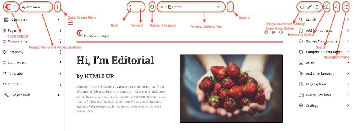
Toolbar
The Toolbar is a fixed element at the top of the page and cannot be scrolled off the page. The toolbar provides contextual workflow and other options relative to the page you are looking at, content you have selected or tool you are using.
The basic elements of the Contextual Navigation bar are:
Branded Logo Button: Toggles the sidebar on/off.
Project Name and Project switcher: Displays the project’s name and lets you switch the project being previewed through a dropdown
Quick Create: A shortcut for content authors to create configured content without having to navigate through the project tree.
Preview Address Bar: An area reserved for navigation buttons (back, forward and reload page), the address of the current page being previewed, and an options link whose content will change based off of the current page view and user role.
Edit Mode Switch: Toggles the in-context editing and Experience Builder panel on/off
Publish Status: Allows the user to view the project’s publish status.
Search: Allows the user to search for items in the project
Navigation Menu: Takes the user to a panel with
GlobalandProjectoptions containing various links such as Dashboard, About, Help, etc.
Sidebar
The sidebar opens a menu that allows access to the following:
Dashboard: An overview of the workflow for that given project. See above for more information
Project Explorer: Allows navigation to all pages, components and documents in the system
Project Tools (available depending on your role): Contains project administration tools such as Plugin Management, Encryption Tool, etc. See here for more information
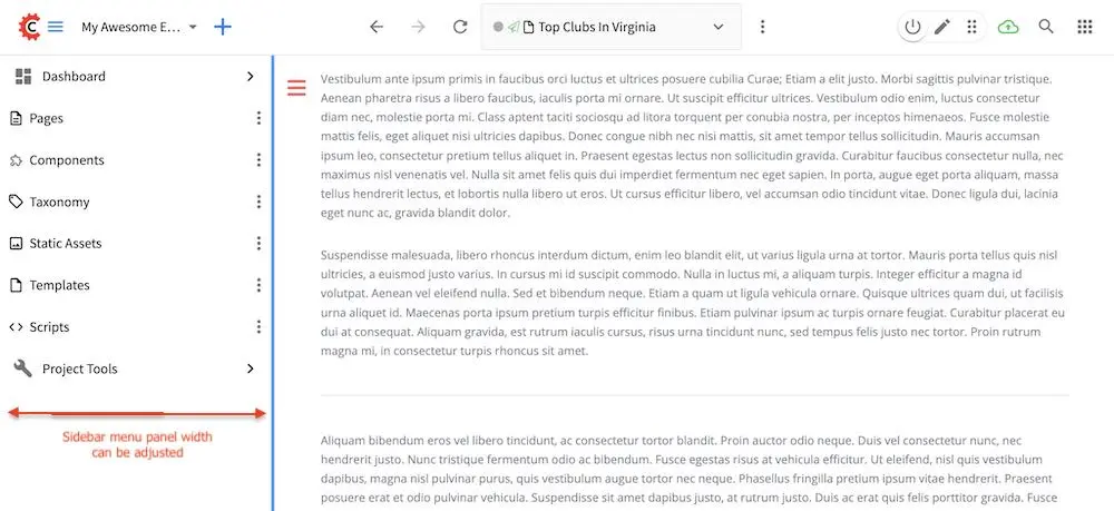
The menu/panel width can be resized freely by the user and will remember where you set the length and width on your browser
Project Explorer
Users can have multiple navigation paths / path tree open at the same time e.g. templates, pages, etc.
If closed, the menu should retain it’s last state when re-opened.
Each item listed has item state and item type icons next to them
Root folders allow a user to drill in to a hierarchy of content. If the item is previewable it will also be clickable.
Clicking on an item will take the author to a preview of the item.
Clicking the three dots next to each item or right-clicking on an item provides the user options whose content will change based off of the item selected and user role.