
Content Modeling
In this section we’ll first discuss what is content modeling, its importance and best practices. We’ll then go into details on how to create the models that best fit your requirements in Crafter Studio.
Content Modeling Guide
Content modeling is the practice of rationalizing and structuring content into an information architecture that includes organizational structures as well as objects, properties, and relationships (often referred to as references) with other content.
This article will explore content modeling, its importance, and how to apply these practices with CrafterCMS.
Foundations
Before we get too deep into the topic of content modeling, let’s cover three foundational topics:
What is content?
Unstructured content vs Structured content
Separating content and presentation
What is Content?
Content is data, but not all data is content. What makes content different from other data is how it is used and who is responsible for creating and maintaining it.
Examples:
A press release, the image(s) associated with the press release, and any associated taxonomy and metadata for the press release are content.
Event details associated with a press release may be content or data. How this information is used and who maintains this data need to be carefully examined. If the data is transactional, it may not be a good candidate for content. However, if instead it simply supports a transaction by describing an event with details and is maintained by business users, it may be a good candidate for content.
A user profile and its attributes are not the type of data that should be considered content.
The term content refers to any data, metadata, or relationships (references) between content that drive an
experience and need to be created and maintained by business users (authors) on a (typically) separate lifecycle from
the experience itself.
Unstructured Content vs Structured Content
Unstructured content is captured and stored in a manner that is not easily machine-readable or that requires parsing or interpretation to be consumed. Unstructured content also tends to include presentation-level instructions for a specific use case. Examples include Office documents such as PDFs and Word documents. Another example is a blog article where the title, summary, and entire body are captured as a single rich text HTML block.
By contrast, structured content is content that is broken down into entities or types, each with individual fields for specific content elements or relationships. Structured content also tends to separate the content from presentation or use-case-specific concerns.
Separating Content and Presentation
The term “presentation” refers to technology, such as markup, code, or other types of instructions, that inform a channel on how to render the content in a particular way for consumption.
Consider the following two methods for capturing title content:
Without presentation concerns:
This is my title
With presentation concerns:
<H1>This is my title</H1>
Capturing and storing the title without the presentation instructions (H1 markup) naturally makes it much more reusable. By not making assumptions about how the content will be consumed, we remove the need to pre-process the content to remove unwanted instructions or the side effects introduced by leaving them in place. Instead, we can simply apply the appropriate markup at the point of use in various locations on our sites and other channels. Supporting integrations that require ingesting content, such as AI and search engines, is also much easier to support when we cleanly separate our content from presentation-level concerns.
With the exception of HTML blocks and rich documents, CrafterCMS captures all content as individual types, fields, and references in a way that is completely free of presentation concerns and is fully reusable. CrafterCMS also creates a text-only variant of HTML and rich document content for use in search-related and alternative platform and placement use cases. See Form Controls for more information on capturing content.
Understanding Content Modeling
Content modeling is the systematic process/practice of defining and structuring the various types of content that a organization uses to communicate with its audience.
This involves identifying content types (such as articles, products, and events), their attributes (title, description, and date), and their relationships.
The Importance of Content Modeling
Effective content modeling offers numerous benefits:
Consistency: Proper factoring in content modeling ensures uniformity across content, enhancing user experience. It improves indexing and ease of integration.
Re-usability: Structured content can be repurposed across different platforms and channels.
Scalability: Well-thought-out models facilitate the addition of new content types and attributes without disrupting existing structures.
Collaboration: Content models provide a clear framework for teams to work together seamlessly.
The continued adoption of new channels, integrations, advanced search use cases, and AI exponentiate the value of the benefits of structured content and content modeling.
Content Modeling in Practice with CrafterCMS
Now that we understand what content and content modeling are, let’s address the practice of content modeling. As you will learn, content modeling is a combination of information gathering, design, and implementation.
Begin with the Business & the Requirements
Your content model and the content it describes must serve your business. Before starting, it’s essential to properly identify and understand the business domain, use cases, and associated stakeholders to avoid duplication and unnecessary refactoring.
Identify and Involve Stakeholders
Content must be aligned with the business and the experiences and platforms that serve it. The subject matter experts in these areas are the stakeholders. It’s important to identify and involve these individuals early and throughout the process.
Common stakeholders include:
Business owners
Content and taxonomy specialists
Content authors/creators and translators
Designers
Developers
Marketers
Understand the Content Use Cases, Channels, Lifespan
The next step is to examine the various use cases for the content closely to understand where and how the content will be used fully.
Things to consider:
Channels: Is the content expected to be consumed by more than one channel? A website, a native model app, a digital experience, and digital signage are all examples of channels.
Re-use locations: Oftentimes, even within a single channel, content is reused. Consider news articles within a news site. The article and all its content and attributes are likely to be presented on the article page, and you would expect the same title, summary, and main image to be displayed elsewhere in featured article promotions, search results, and similar contexts.
API: Is content available via API, so both current and future channels can leverage it. It’s often helpful to fully consider the dominant APIs you expect to leverage, as some APIs like GraphQL may have implications for your design.
It’s also important to understand that not all content is created equal. Some content is high-value and evergreen. This content is often referred to as Enterprise content. Other content is entirely short-term and situational, or use-case specific. The more high-value the content is, the more worthy of your time as a designer it is.
Considerations for Consumption, SEO, Search Indexing, AI, and other Integrations
The types of delivery platforms and the shape of our API responses, along with common integrations for SEO, Search Indexing, and AI, may add new requirements or impact our existing model design. Careful consideration of these topics can help prevent rework later in the process.
APIs / Content Consumption Support
Consider each API and channel you plan to use to deliver the content. Do you need any properties or instructions to support the channel? The key here is to capture these values as their own field rather than embedding the information in the content. In this way, the information can be ignored where it is not useful.
A few examples of this:
Behavioral properties of a slider
Dimensions of an image
Geo-fence coordinates
SEO Optimization Search Engine Optimization is extremely valuable. In addition to the content your users get, most search engines look for and leverage specific types of metadata to help them understand the intent and audience of the content. Add specific fields to support SEO directly within your models like the following:
Meta Titles and Descriptions
Canonical URLs
Image Alt Text
These fields can be indexed, exposed via APIs, and rendered in templates to optimize for search engines.
Advanced Search Capabilities with OpenSearch Query-driven content is a powerful capability offered out-of-the-box by CrafterCMS that powers search, personalization, AI use cases, and more. To get the most out of these capabilities, you will need to fine-tune your content model, We will cover specifics of these topics in detail when diving into content type modeling practices.
Areas of concern for search include:
Ensure that mandatory fields in search queries are marked as required.
Data Typing: Ensure attributes are assigned the proper data type (string, integer, float, boolean, HTML, etc) for programmatic use, indexing, tokenization, and analysis.
Properly factor models to ensure consistency of fields (e.g., a Title on one type should be the same as a title in other types)
Multi-value fields: In some cases, you want to capture values as arrays, for example, strings in a repeat group. In this case, you will mark the fields post-fix with
_ssTokenization: Open Search offers various tokenization options tailored to specific data types. Your tokenization strategy depends on how you intend to query the data. CrafterCMS automatically assigns strategies based on the postfix and provides additional options on field types to allow you to augment this behavior. You can learn more about tokenization here: https://docs.opensearch.org/docs/latest/analyzers/tokenizers/index/
Flattening: As authors, we often want to build up content through composition. A great example of this is when an author builds a page by dragging and dropping sections onto it and then adding components, such as paragraphs, images, and sliders, into the sections. This is great from an authoring perspective, but from a developer perspective, it’s likely you will want all of these separate content objects “flattened” into a single object for indexing. Conversely, there will be some content relationships, like references to other pages, that you do not want flattened into the object. You can learn more about search index document flattening here: Content Modeling
A note about Rich Text (RTE) and Rich Documents:
Rich documents are processed for full text indexing up to a specified number of characters. The mime types and the amount of content (character count) to index are controlled by configuration. A special content field is made available in the index that contains the indexed value. CrafterCMS supports a concept called jacketing in which rich documents can be paired with a content type, allowing for the full-text indexing of a given document to be associated with a specific content type in a single search entry. You can learn more about this here: Jacket
Rich Text/HTML: markup captured by Rich Text Editors (RTEs) is automatically indexed as both raw and plain text, allowing it to be properly searchable and used with or without markup as needed. When a field variable name ends with the
_htmlpostfix, it is stored in the index as_htmland_raw, where:_htmlcontains the content without markup_rawcontains the content with markup
This can be confusing to some developers as the
_htmlname is the only name available to developers through non search based APIs and yields the content WITH markup. That said, this is because typically, when querying the search index and leveraging its values, developers want the value without markup.AI Integration Generative AI, integration with AI backends, and AI-powered user experiences are rapidly evolving and demanding spaces in terms of requirements.
You want to ensure you’re accurately describing content types, fields, and their proper use, so that these details can be fed into generative AI when it assists you in creating content. This is done through content type and field-level descriptions, help, and constraints.
You also want to consider how AI will be used to consume and leverage your content within end-user experiences. Do you need to modify your content model in any way in order to make your content easier for AI to leverage? We recommend structured content as opposed to unstructured content as structured content makes it more ideal for AI-related use cases. Further, CrafterCMS stores content modeling metadata and content as XML within files. This is a format and storage implementation that is the ideal format for AI ingestion and training workloads.
Consider Localization Localization, personalization, and accessibility concerns may add additional requirements to your model and/or new workflow.
Personalization and Multivariate Testing Personalization and multivariate testing often require content model augmentation in the form of additional content fields and metadata, as well as, in some cases, separate but related content. Consider your use cases to ensure the model has been adjusted appropriately to support your needs.
Accessibility Accessibility often requires additional fields, such as alternate text for images and other media, as well as further information on links. It’s also important to review your use of markup in rich text editors and templates to ensure that your markup is WCAG compliant. Accessibility is a crucial requirement, and the demand for strict adherence to accessibility guidelines and standards is increasing. It’s much easier to support these needs when they are considered up front rather than trying to retrofit support at a later date.
Consider Future Channels and Use Cases
More often than not, we begin developing a content model for a specific use case and a set of channels, and it’s natural and appropriate to focus a lot on these. That said, especially when it comes to high-value and evergreen content, we need to allocate some time to considering future channels and use cases, as well as how the design choices we make today may impact our ability to support these types of requirements in the future.
Tips to help you future-proof your content:
Plan for multichannel delivery from the start.
Avoid over-specifying fields; add only what is necessary, note any relevant details, and keep track of potential extensions. This can be seen as a statement in conflict with the previous item. Sometimes it is. That said, it is also often true that less is more. Here, you must find a balance. Over time, lessons learned through experience will guide you.
Use taxonomies to classify content, making it more findable for reuse.
Consider the Content Production and Workflow Process and Concerns
Another area of requirements that can impact your content model is the content creation and workflow process. We want to ensure that we’re not creating hard dependencies and relationships between content that could create bottlenecks in everyday workflows.
Design and Document the Content Model
Once you have a clear understanding of the requirements and buy-in from the business and other stakeholders, we can begin the process of designing our content model.
The following documentation here: Content Modeling, provides detailed instructions on how to use the modeling tools within Crafter Studio.
What we will do here, instead, is to provide you with additional background and guidance to assist you and help you think about and improve upon the models you create.
Identify the Content Types
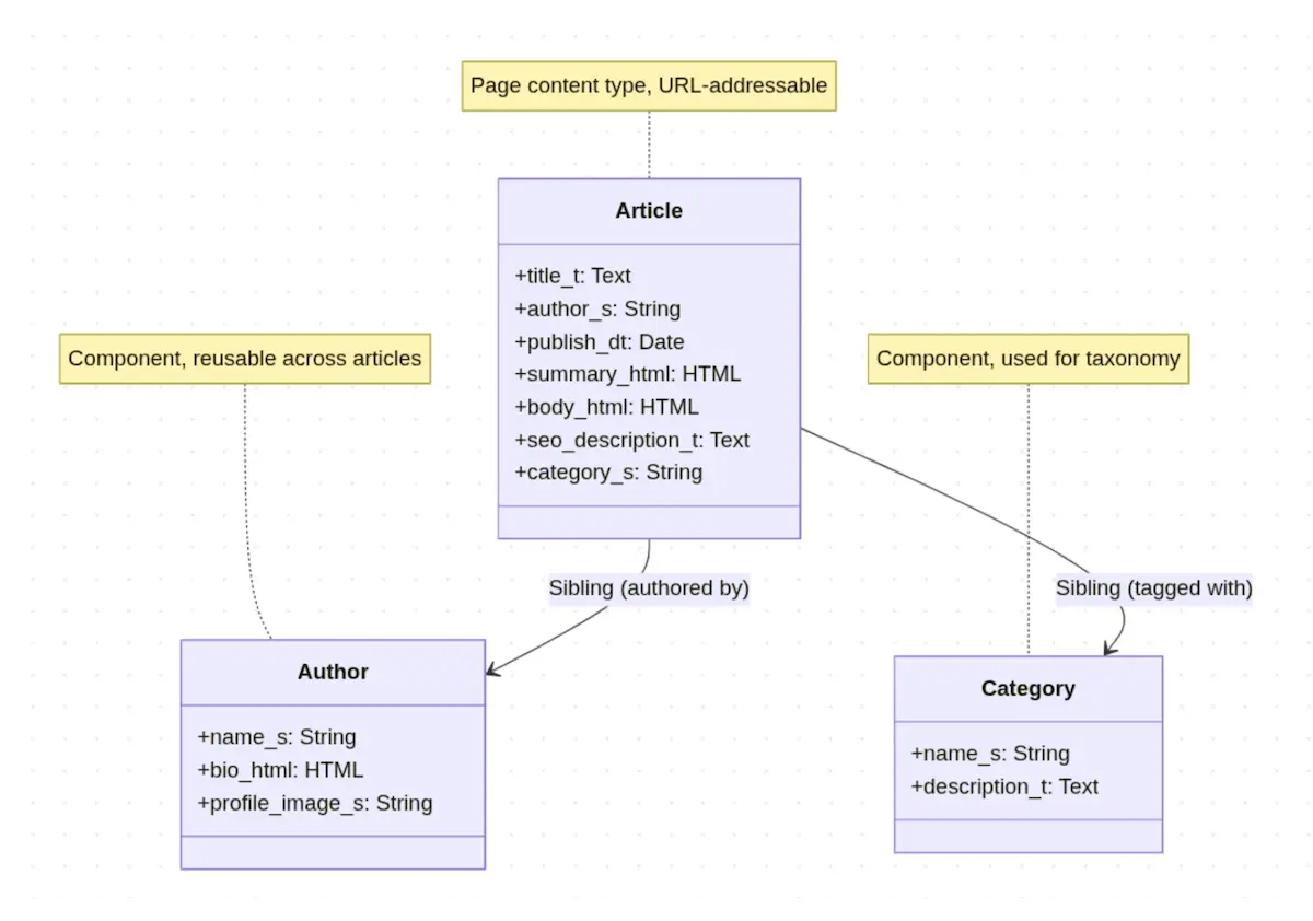
The first step is to identify the content types. Content types refer to the objects or entities within our content model. These are the objects that represent articles, bios, product content, recipes, web and app pages, and screens, as well as the components displayed on those pages and screens.
Pages vs Components CrafterCMS makes a distinction between content that is a page vs a component. A “page” is intended to represent a web page or a screen in an application. The reason we make this distinction is to enable a few pre-configured behaviors within Crafter Studio, the authoring environment, and Crafter Engine, the content delivery server, as well as our out-of-the-box OpenSearch indexes and integrations.
Generally speaking, a page is any object that represents a page or a screen in an application and that, in the case of web pages, you want to be URL addressable.
A common example of an entity type that causes some confusion is an article or product. The question often arises: Should each article or product be considered a page? In the case of a product, it’s usually a bit clearer. A given product tends to be one of thousands or more instances in the system. The pages and screens they are rendered on tend to be the same structure for every product. Any changes to that page’s structure and layout should be managed centrally. In this case, we would create a Product Detail page object to render product details and make each product a component.
Articles could follow the same pattern, but the template typically defines the structure. Articles are URL-addressable items, and we gain a greater benefit from making them a Page. Either approach will work for both use cases; choose the approach that makes authoring and primary rendering of the object as simple and easy as possible.
Identify the Attributes for each Content Type
The next step is to identify the attributes (often referred to as fields) for each content type. These correspond to visual and non-visual elements of content and metadata required to describe the content, support the use cases, and enable workflows. For each element, specify the following:
Attribute Name: The label of the attribute
Attribute variable: The variable name with type postfix
The data type: This corresponds to the postfix in the variable name
Field type:
Data type:
Constraints
Notes
Let’s consider an Article page:
Visual elements:
Attribute Name |
Variable Name |
Field Type |
Data Type |
Constraints |
Notes |
|---|---|---|---|---|---|
Title |
title_t |
Input box |
Text |
Required 250 chars |
|
Author Name |
author_s |
Input box |
String |
Required 250 chars |
|
Publish Date |
publish_dt |
Date Picker |
Date |
Required |
|
Article Summary |
summary_html |
Rich Text Editor |
HTML |
Required |
|
Article Body |
body_html |
Rich Text Editor |
HTML |
Required |
Functional (non-visual) elements:
Attribute Name |
Field Type |
Data Type |
Notes |
|---|---|---|---|
SEO Description |
Input box |
Text |
|
SEO Keywords |
Input box |
Text |
|
Featured |
Checkbox |
Boolean |
|
Category |
Dropdown |
String |
|
Disabled |
Checkbox |
Boolean |
Factor Familiar Entities and Fields
A blog, a video, a press release, an article, etc., has a title field. It’s best to define what a title (or any other common field) looks like regarding length and other constraints. This significantly enhances clarity for authors, facilitates AI assistance, and ensures alignment with search indexes and GraphQL.
This exercise involves both planning and design, as well as execution. To facilitate the planning and design phase, use a spreadsheet or data modeling tool to map out and label your content types and fields.
To facilitate the execution of this practice, there are three approaches to consider:
Capture common attributes in a component and build larger content types by embedding the components as referenced or embedded objects.
Build a robust version of the field with every parameter set up properly, and then copy the field to other types.
Where common values in common fields apply, leverage Crafter CMS’s inheritance mechanism.
Identify Relationships
A lot of content can be modeled as stand-alone entities, and that’s ok. In fact, when the requirements are simple, it’s a best practice to keep the model simple. For example, let’s imagine a blog article for a company’s main website where there’s a single unnamed author (the company) and where the publishing volume is relatively low, e.g., approximately a blog a week. In this case, it’s probably better to create a blog article that has all of its relevant fields associated with it, is not built up with a compositional approach (using drag and drop), and does not have any direct relationships with other content objects.
On the other hand, if we are modeling an article type for a news room full of different authors that’s going to be presented on a site with thousands or millions of other articles where taxonomy will be a key driver of how the content is delivered, then yes, we’re going to want to correlate that article with author objects, related articles, and taxonomy.
The point is that relationships are an essential aspect of our content model, and we need to think deeply about each relationship, its type, and what it means for the authoring experience and how it impacts the delivery of the content.
There are two main types of relationships:
Static relationships: One content item is explicitly declared related to another content object by id/name.
Dynamic relationships: Content is related to other content via query criteria.
To illustrate this, let’s consider articles that are “tagged” with category taxonomy objects. Each time we add a new category taxonomy object’s ID to the list of category IDs in the object, we are making an explicit relationship between that article and the taxonomy object.
Now, if we create a category section page for each taxonomy object and write a query to retrieve all articles tagged with a given category, a dynamic relationship exists between the category page and the articles it displays.
When we design our content model, we handle the two types of relationships differently. For dynamic relationships, we simply track them as use cases. This inventory can be used to help validate our model through a thought experiment and automated testing. As content modeling practitioners, our task is to define the static relationships in a logical way that will properly facilitate all of our authoring and delivery use cases.
With this in mind, we can further subclass static relationships:
Parent-child: The referenced content is subordinate to the object. Virtual classes have lessons, which in turn have topics, and so on.
Sibling: The referenced object is equal with respect to structure, but is related in some way: For example, a curated related list of related articles.
Part-of: The referenced object is not meant to stand on its own. The parent is built up or composed of other objects for the convenience of the authors.
In CrafterCMS, most of the relationships are expressed in the same way: through the item selector. By taking the time to consider the relationships thoroughly, we allow ourselves to assess the impacts and side effects of our design choices.
That said, the Part-of relationship does have specific implementation requirements in CrafterCMS. Content modelers must decide if the child content portion of the part-of relationship will be stored as a standalone “shared” object or as an embedded object.
Embedded object: The child object/component’s XML is stored inside the parent’s XML document. This makes physically moving objects, removing objects, and reverting objects more straightforward.
Shared object: It’s possible to create a standalone child content object in CrafterCMS, whereby the child object is stored as a separate XML document. This is essential if the child’s content is going to be reused by multiple parents. A good example of this is videos that are part of multiple video Playlist objects.
That said, it’s also possible to use a shared object even when only a single parent is expected. This is referred to as an item-specific shared object. The reason this exists is historical. Shared objects were made available before support for embedded objects was introduced. Given this, most of the time, item-specific content should be modeled as embedded objects.
Content Types, Content, APIs, Controllers, and Templates in CrafterCMS
While the purpose of this article is to discuss content modeling, it can be helpful to understand how content types (the result of content modeling) fit into the bigger picture.
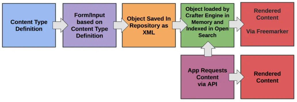
Once we have completed the requirements and design phase of our content modeling exercise, we use the Crafter Studio application’s content modeling tool to create Content Type definitions. As shown below. These definitions are visualized in the application and are stored in our projects as XML documents.
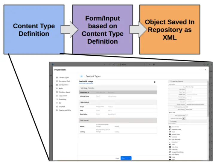
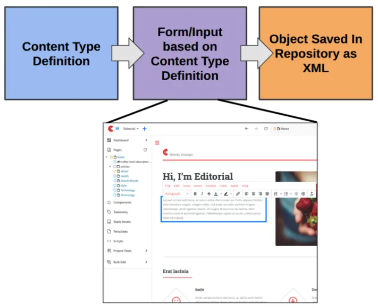
As we’ll see more fully in the next section, these content type definitions are used by Crafter Studio to create content capture interfaces and forms that enable users to enter and modify content.
Upon save, Crafter Studio saves a version of the content to the repository as an XML document, as shown below. This XML document is separate from the content type definition XML document, but it references the definition.
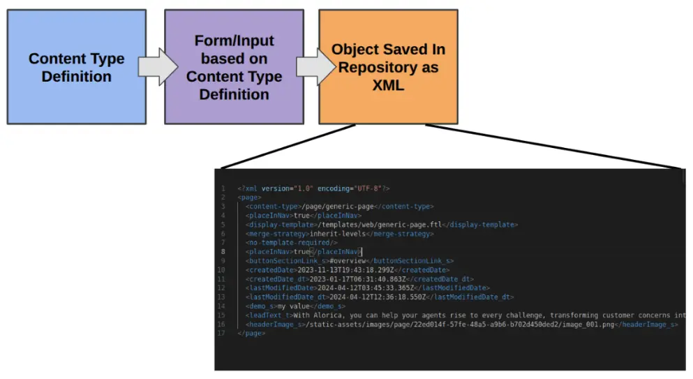
Upon save within Crafter Studio and upon publish operations within the delivery subsystem, content is loaded into Crafter Engine’s in-memory database and indexed into OpenSearch.
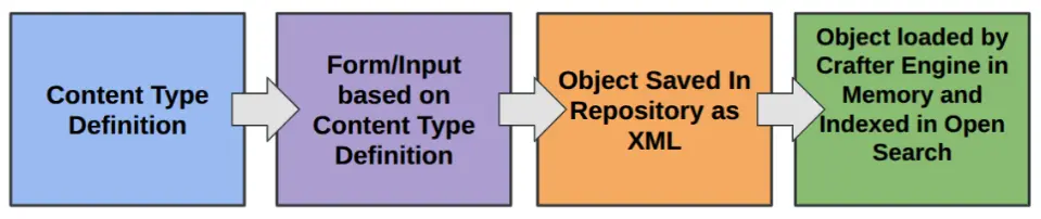
Once loaded into Crafter Engine and indexed into OpenSearch, the content can then be consumed through APIs, server-side controllers, and/or server-side templates.
The Use of Content Types by Crafter Studio and Deployer
Content type definitions are sometimes referred to as form definitions historically. This no longer accurately describes the full breadth of use cases for content type definitions. Today, content definitions power and drive several components and aspects of the platform. In this section, we’ll briefly identify these.
Power Experience Builder
Experience Builder is a rich and robust in-context editing tool for websites and other types of digital experiences.Enables authors to edit content and drag-and-drop layouts directly in the browser.
Utilizes Content Type definitions to facilitate content editing, enforce constraints, and relationship rules.
Generate and Power Authoring Content Forms
Authoring Content Forms are content entry screens and dialog boxes. These forms are dynamically generated by rendering the sections and fields described in the content type definitions as form sections and content entry fields.Drive Automated Schema Generation for GraphQL
GraphQL is a schema-backed, query language for APIs available in CrafterCMS. CrafterCMS automatically generates the Schema for the GraphQL backend by interpreting the content type definitions and converting them to GraphQL schema definitions.Drive OpenSearch Indexing Integration with the Deployer
CrafterCMS provides out-of-the-box integration with OpenSearch. OpenSearch is a powerful document-based information query and retrieval platform optimized for search use cases. CrafterCMS’s Deployer component is used to index content into OpenSearch. The Deployer uses content type definitions to implement indexing rules related to field types, tokenization, and relationship flattening.
Best Practices for Constructing Content Types
To construct content types in CrafterCMS, developers and power users utilize the Content Modeler to define and modify content type definitions. The following document: Content Modeling, covers the details of the content modelling tool, Form Controls, and Data Sources.
We want to focus on the things that we can do to improve our outcomes when constructing content types.
Configure a Preview Image for the Type
Each type has an option for a preview image. Distinctive images that show the type of content or its use help authors quickly identify the correct type when browsing through lists of possible types. You can learn more about this here: Properties of Content Types
Organizing Section and Fields
Content Type definitions are broken up into Sections. Sections are intended to be logical groupings of related fields. Each section has a label, optionally a description, and any number of fields. How we organize and populate sections can significantly impact authors’ editing experiences and integrations, such as Search and AI, as described above. Here are a few tips that can improve your outcomes:
Place like sections in the same order across all types: By structuring similar sections in the same order across all of our content types, we’re helping to create muscle memory for our content authors. This reduces the act and sense of “hunting” for what they need, making them more efficient.
Always fill out the section label and description: The label and description provide key information about the fields in the section. A good description not only helps content authors but can be leveraged by generative AI to improve the quality of the content.
Set rarely used sections to be collapsed/closed by default: Sections can be configured to start open or closed. A section with a required field will always open when a form is presented to a user, but if it has no unsatisfied constraints and is configured to be closed, it will be rendered in a collapsed state initially. This is valuable for sections that contain content or configuration that is rarely touched because it initially hides the details, highlighting other sections and fields that are more actively managed.
Configuring the Field Label, Description, and Help
Similar to sections, fields also have labels, descriptions, and an additional help property. Filling out these properties thoroughly will enhance content authors’ understanding of the field and its use case, and also facilitate the integration of generative AI. Here are a few tips to keep in mind: #. Use business user-friendly label names #. Use the description to provide essential and immediate details about the type of input you want and how it will be used. #. Use the Help property (which is a rich text field) to expand on the description with detailed information. #. For common fields, fill out this information once and copy the fields to other definitions to maintain consistency. Future versions of CrafterCMS will improve upon this.
Configuring Field Constraints
Every field in a content type definition can be marked as required or not. Additionally, each field type has constraint properties that are relevant to the kind of content it is intended to capture. Taking the time to configure constraints sensibly and thoroughly ensures that the system captures content in a way that is appropriate for the various delivery use cases. Constraints warn authors early, eliminating the need for them to do edge case testing of experiences before publishing.
Configure Content type Applicability
Content is stored in folder structures that align with the organizational aspects of our information architecture. In CrafterCMS, this aspect of the information architecture is expressed as a folder structure. In some cases, this organization aligns with our URL structures for websites or screen hierarchies for native apps. Often, the structure aligns with the type of content, the use case, or the authoring process, rather than with other types of content. Regardless, it is typically the case that certain content types should only be used to create content in specific folders. In CrafterCMS, you can configure each content type with the folders to which it applies. Crafter Studio utilizes this configuration to enhance the authoring experience by presenting only the types of content relevant to the author. See the following documentation for more details: Content Creation Permissions
Configuring Rich Text Editors
Rich Text Editors (RTEs) are very powerful content entry controls. CrafterCMS uses TinyMCE as the foundation of its Rich Text Editor control. An administrator can precisely control the options available to authors in each rich text editor field. Follow this documentation for detailed configuration instructions: RTE Configuration
Here are a couple of items to think about and configure when using Rich Text Editors:
Right-size the Toolbar Options: TinyMCE is a powerful rich text editor with numerous tools and options. Not all of these options make sense for every RTE input. Further, in some cases, you may want to eliminate options because, while technically valid, they create brittle markup (for example, the color control). Consider each RTE, its corresponding use case, and then eliminate all unnecessary options from the toolbars and other configurations. Doing so streamlines the authoring experience and eliminates possibilities for authors to create brittle markup unknowingly.
Leverage the Insert Style dropdowns: The style and format dropdowns enable you to format and stylize copy using semantic markup and CSS, rather than brittle markup.
Link the appropriate data sources to the RTE: If you plan to allow authors to insert links, videos, and images, ensure that you have configured the corresponding data sources. If you don’t want authors to insert these elements, remember to remove the option.
Configure the RTE height: Rich Text Editors can occupy a significant amount of space. Sometimes you need less, other times you need more. For small sections, set the height to be less to make forms smaller. For long article bodies, set a large, “comfortable” RTE size.
Extending the Form Engine
CrafterCMS is a platform. This means you can extend it to meet the authoring and content delivery needs of your specific use cases. There are four mechanisms for extending the Content Types and the Form Engine behind Content Forms and the Experience Builder:
Content Lifecycle Controller (Server Side)
Configuring a content type with a Content Lifecycle Controller introduces the ability to execute code on specific lifecycle events, such as create, update, copy, and delete. You can use these events to modify the content before saving or to support integrations.
Content lifecycle controllers are automatically wired in through their
controller.groovy. This file lets you:Inspect the content, user, path, type, and lifecycle operation (create/update/move/etc).
Run logic before the save completes, such as integration calls, data checks, or transformations.
Block, modify, or enhance the save process without touching the UI.
See Server-Side Form Controllers for more information.
Form Engine Controller (Client Side)
On occasion, you want to enforce specific rules and actions between fields in the Form Engine. For example, if the user chooses a particular country, show fields specific to that country. Such use cases apply to the Content Authoring Forms (but not the Experience Builder). To support these use cases, you can introduce a Form Engine Controller, which provides you with specific event hooks like “On Initialization” and “On Save” where you can execute custom client-side code.
See Client-Side Form Controllers for more information.
Custom Form Controls
You can create and install custom form engine controls that provide authors with new ways to enter content. For example, a custom slider control for picking a value in a range. Another example might be a custom asset picker with a platform like Cloudinary or Bynder. Custom controls are written in React and packaged and installed as plugins. You can learn more about custom form controls here: Building Form Engine Control Project Plugins.
Custom Data Sources
Sometimes we want to use the same form control (like an image or video picker) but supply a custom backend from which to select the asset. As previously mentioned, this is why we have data sources in the content type system. It is possible to create, package, and install your own custom data sources. Custom data sources are written in React and packaged and installed as plugins. You can learn more about custom data sources here: Building Form Engine Data Source Project Plugins.
Content Modeling in Studio
Every content object in CrafterCMS is an object associated with a Content Model. Content Models allow you to add structure to your content and facilitate consumption via various visual representations or via APIs. One of the great things about CrafterCMS content models is that your content can be semi-structured which allows content authors the freedom to be as creative as they’d like to be, but provide the template/UI and API developers enough structure to produce solid multi-channel renditions of the content. This section will walk you through Content Type management in Crafter Studio to help you create the models that best fit your requirements.
Content Types in Crafter Studio
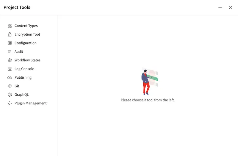
Content Type Management in Crafter Studio is located in the  .
.
Content Types are one of two core types: Pages and Components. Both are made up of three ingredients:
Model: The content pieces that will be captured from the content authors for the page or component
View: The view template that will render the content, typically to HTML markup (for Templated, not Headless, projects)
Controller: The controller that handles the incoming request for the page or component
Pages
Pages are top-level container types. Pages hold content, and optionally components. Content within pages is made up of various types, for example content can be a date, an image, or a rich text field.
Components
Components only differ from pages in that they can’t render by themselves, instead, they must render within a container page or another component.
When to model as a page vs component
Model content as a component for meaningful chunks of content, say content containing all things about our “Our Team”, or say, content containing all things for a header or footer.
Model content as a page for content made up of various texts, images, components, etc.
Content Type Model Definition
Content models are defined via Crafter Studio’s graphical modeling tool under Content Types:
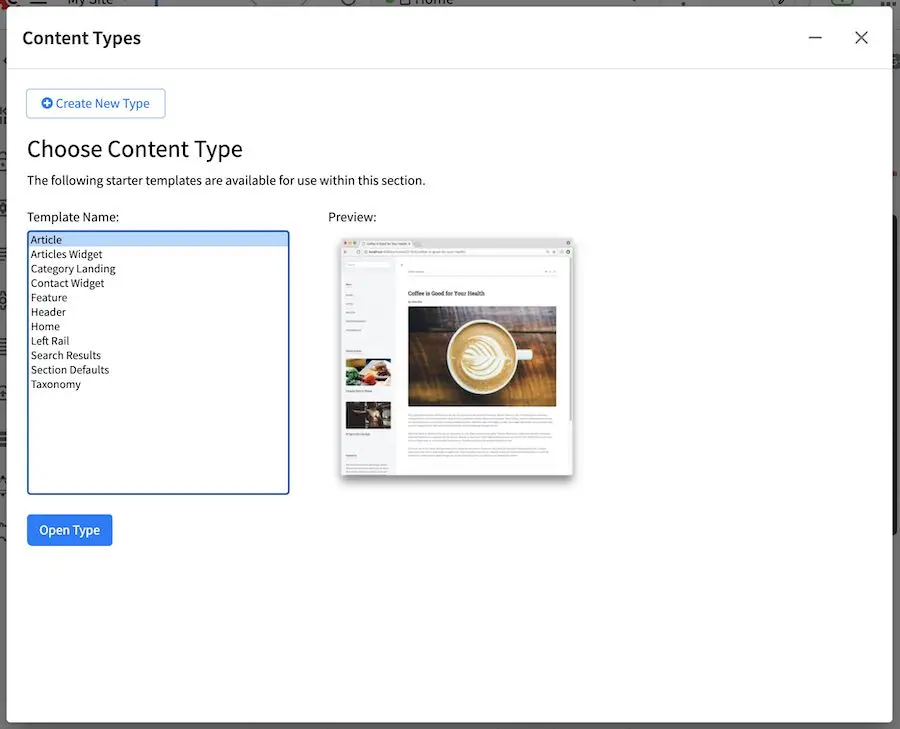
You can now either create a new content type or open an existing type. Creating a new content type brings up a dialog that requests some basic content type information.
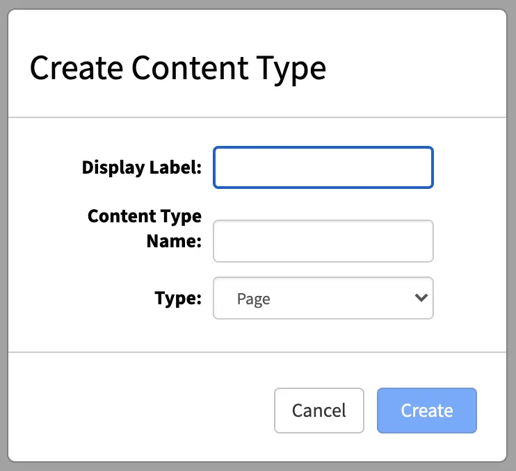
You now specify:
Display Label: The name of your new content type as you’ll see it in Crafter Studio.
Content Type Name: The low-level system name of your content type, this field will be automatically generated for you. Modify this only if you know what you’re doing.
Type: Choose if you’re defining a Page or a Component.
Form Builder Basics
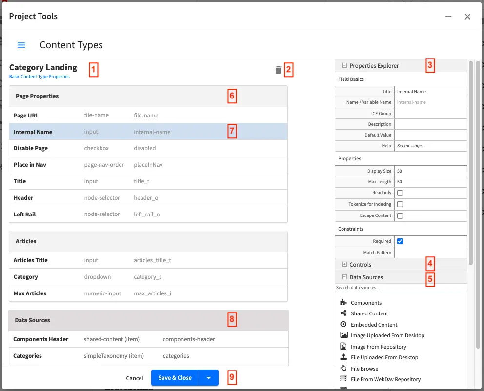
Crafter Studio’s Form Builder
Label
|
Description
|
1
|
Form Builder: The beginning of the form builder and it’s headed by the name of the
currently open Content Type.
Click here to explore the global properties of the type in the Properties Explorer,
#3.
|
2
|
Delete Icon: Deletes the current content type
|
3
|
Properties Explorer: Helps configure the properties of the currently
selected item. Clicking on an item on the left side of the screen,
like #2 or #7 will populate this control and allow you to modify
the selected item.
|
4
|
Form Controls: This is a list of available form controls for you to build your own
form with. Note that the list can be expanded or collapsed and a search can also be
performed instead of scrolling through the list.
Controls can be dragged from the controls list onto the form builder.
|
5
|
Data Sources: Shows the list of available data sources that can be attached to this
content type such that the content authors can pull content and incorporate it into
pages or components. Data Sources can be dragged over to the form builder
and configured as needed.
The content author will then use the control to pull data from that data source into
the content object.
|
6
|
Form Section: Form sections help cluster a number of controls together to make it
easier for content authors. Click on the form section to edit its properties in
the Properties Explorer.
|
7
|
Form Canvas: Actual controls that have been placed on this form.
Clicking on a control will allow you to configure this control in the Properties
Explorer.
|
8
|
Data Source: The data sources configured for this content type.
To configure a data source, click on it and then edit the properties
in the Properties Explorer.
|
9
|
Save or Cancel the changes to the Content Type.
|
Properties of Content Types
Let’s select the content type itself, by clicking on the content type name at the top of the Form Builder and explore its properties.
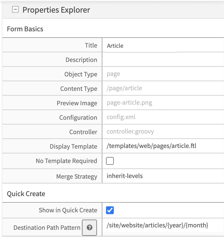
The fields available at this level are:
Field
|
Description
|
Title
|
Content Type’s friendly name
|
Description
|
Description of the Content Type
|
Object Type
|
Page or Component (read only)
|
Content Type
|
System name and path of this content type (read only)
|
Preview
Image
|
|
Configuration
|
Contains
config.xml which holds information about the content type suchas the limit where content can be created, is it previewable, etc.
See Client-Side Form Controllers for more information on using form
engine controllers.
|
Controller
|
Contains
controller.groovy which provides an extension/hook to authoringlifecycle events.
See Server-Side Form Controllers for more information.
|
Display
Template
|
View template to use when rendering this content
|
Merge
Strategy
|
The inheritance pattern to use with content of this type, please see Content
Inheritance for more detail on this feature Content Inheritance
|
Show in Quick
Create
|
Show this content type in the quick create menu from the context nav
|
Destination
Path Pattern
|
Path pattern where the content created from quick create will be stored.
The patterns available are the following:
{objectId} Inserts a GUID.
{year} Inserts the current year (4 digit year).
{month} Inserts the current month (2-digit month of the year).
{yyyy} Inserts the current year (4 digit year).
{mm} Inserts the current month (2-digit month of the year).
{dd} Inserts the current day (2-digit day of the month).
|
The 2 key properties are: the display template (Content Type View Templates) which is the HTML template that renders the final Web page; the content inheritance (Content Inheritance) which determines how this content type will inherit from parent XML files in the system.
Content Creation Permissions
Limiting where a content type can be created is through the Configuration Property of a content type (config.xml) using the following tags:
1<paths>
2  <includes>
3    <pattern>REG_EXP_HERE</pattern>
4  </includes>
5</paths>
OR
1<paths>
2  <excludes>
3    <pattern>REG_EXP_HERE</pattern>
4  </excludes>
5</paths>
You can only use one of either include or exclude. Use Include when you need to whitelist places, use exclude when you need to blacklist.
We’ll look at an example of limiting where you can create content from the Website_Editorial blueprint that comes out of the box.
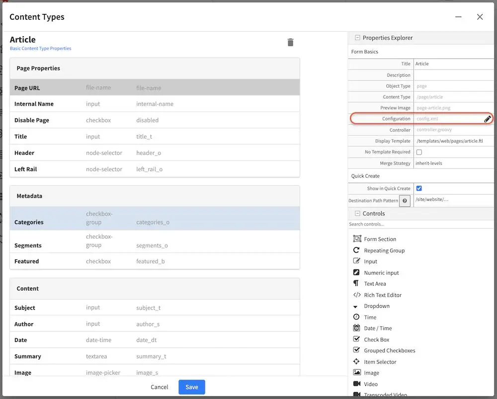
From the Sidebar, click on . Next, click on Content Types then either create a new content type or open an existing content type. In the image below, we have the content type Article open for editing. Go to the Properties Explorer and click on Configuration. A pencil will appear next to the file name config.xml, click on that pencil to edit.
To limit where this particular content type can be created, the tags, <paths><includes><pattern>some_regex_pattern</pattern></includes></paths> are included towards the bottom of the file. Here, we can see that content type Article can be created anywhere under /site/website/articles
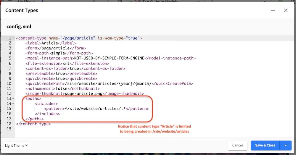
1<paths>
2  <includes>
3    <pattern>^/site/website/articles/.*</pattern>
4  </includes>
5</paths>
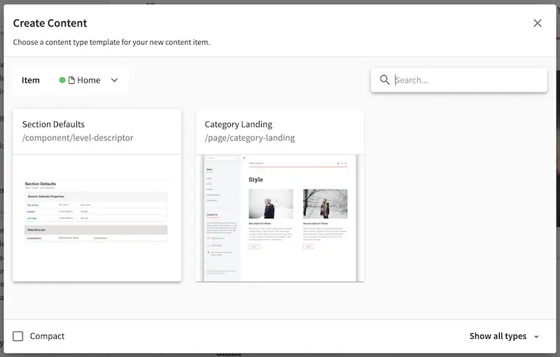
To see how the above tags/example works, go to the Sidebar and right click on the Home folder and select New Content. Notice that content type Article is not available from the content types listed.
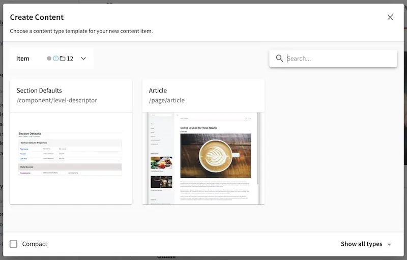
From the Sidebar again, navigate from the Pages folder to the /Home/articles/2020/12/ folder then right click and select New Content, notice that the content type Article is available from the list.
To see more examples, try creating content types in the other folders in the Sidebar such as the Taxonomy folder, the Components folder and anywhere under the Pages folder.
Cascade on Delete Configuration
Cascade on delete allows the automatic deletion of child items matching a regexp when a content is deleted.
Enabling cascade on delete is configured through the content type Configuration property (config.xml) using the following tags:
1<delete-dependencies>
2  <delete-dependency>
3    <pattern>REG_EXP_HERE</pattern>
4    <remove-empty-folder>false</remove-empty-folder>
5  </delete-dependency>
6</delete-dependencies>
We’ll look at an example of how to enable cascade on delete on the Article content type in the Website_editorial blueprint.
From the Sidebar, click on . Next, click on Content Types. We will select the content type Article for editing. Next, go to the Properties Explorer and click on Configuration. A pencil will appear next to the file name config.xml, click on that pencil to edit.
We’re going to enable cascade on delete for articles (Article content type) containing images under /static-assets/item/images, and we’ll also delete empty folders under /static-assets/item/images by adding the following code in the config.xml file:
1<delete-dependencies>
2  <delete-dependency>
3    <pattern>(^/static-assets/item/images/.*)</pattern>
4    <remove-empty-folder>true</remove-empty-folder>
5  </delete-dependency>
6</delete-dependencies>
To see cascade on delete in action, let’s create a new article (Article content type) under one of the article folders in the Sidebar. Enter data in the required fields and remember to upload from desktop an image in the Image field in the Content section. Click on the Save & Close button.
Let’s look at the dependencies of our newly created article, where we expect the image under the static-assets/items/images/2021/01/26 will be deleted when we delete the article since we have configured cascade on delete for content type Article for items under the directory static-assets/item/images:
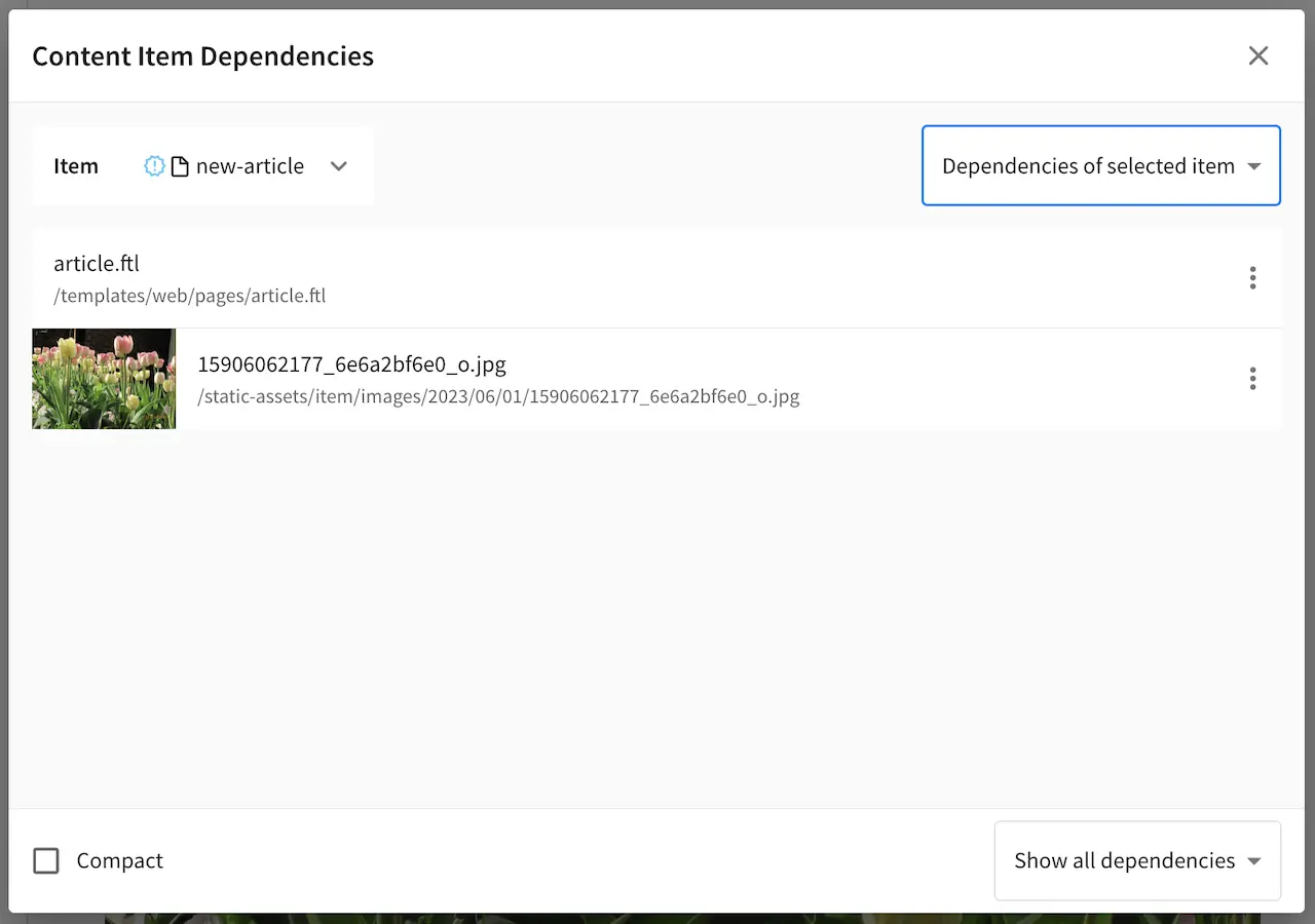
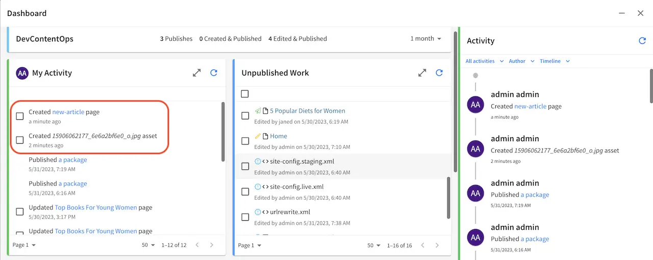
Open the Sidebar and navigate to the newly created article. Right click on the newly created article and select Delete. Open the Dashboard and notice the items listed as deleted in the My Recent Activity widget.
Copy Dependencies Configuration
Copy dependencies allows the automatic copying of child items matching a regexp when a content is copied.
Enabling copy dependencies is configured through the content type Configuration property (config.xml) using the following tags:
1<copy-dependencies>
2  <copy-dependency>
3    <pattern>REG_EXP_HERE</pattern>
4    <target>FOLDER_FOR_COPIES</target>
5  </copy-dependency>
6</copy-dependencies>
We’ll look at an example of how to enable copy dependencies on the Article content type in the website editorial blueprint.
From the Sidebar, click on at the bottom. Next, click on Content Types. We will select the content type Article for editing. Next, go to the Properties Explorer and click on Configuration. A pencil will appear next to the file name config.xml, click on that pencil to edit.
We’re going to enable copy dependencies for articles (Article content type) containing images under /static-assets/images/ and placing the copies in folder /static-assets/images/articles/ by adding the following code in the config.xml file:
1<copy-dependencies>
2  <copy-dependency>
3    <pattern>(^/static-assets/images/.*)</pattern>
4    <target>/static-assets/images/articles/</target>
5  </copy-dependency>
6</copy-dependencies>
Click on Save & Close, then save changes made to the content type by clicking on Save.
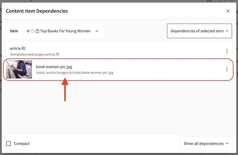
To see copy dependencies in action, let’s copy an article under one of the article folders from the Sidebar. First, we’ll create the folder articles under /static-assets/images. Next, we’ll navigate to articles/2020/12/Top Books For Young Women. Right click on the article and select Copy. Navigate to articles/2020/7, right click on the folder and select Paste.
Let’s look at the dependencies of our copied article, where we expect a copy of the image under the static-assets/images/articles will be located since we have configured cop dependencies for content type Article for items under the directory static-assets/images:
Item Specific Dependencies
Item specific dependencies allows for the automatic copying of child items matching the regex pattern in the studio-config.yaml file when a content is copied. It also allows the automatic deletion of child items matching the regex pattern in the studio-config.yaml file when a content is deleted.
Below is the regex pattern for item specific dependencies:
# Regex pattern for item specific dependencies
studio.configuration.dependency.itemSpecificPatterns: /site/components/page/.*,/static-assets/page/.*,/site/components/item/.*,/static-assets/item/.*
/site/components/page/.* and /static-assets/page/.* are legacy regex pattern for backwards compatibility. Moving forward, we suggest using the following regex patterns for item specific dependencies: /site/components/item/.* and /static-assets/item/.*
Item specific dependencies are configured during content type creation. We’ll look at an example of how content is modeled to take advantage of item specific dependencies, using the Article content type in the website editorial blueprint.
From the Sidebar, click on at the bottom. Next, click on Content Types. We will select the content type Article for editing.
Scroll to the Data Sources section, and click on Upload Images. Notice the value in the Repository Path property, which is the path where to store the new file uploaded from desktop.
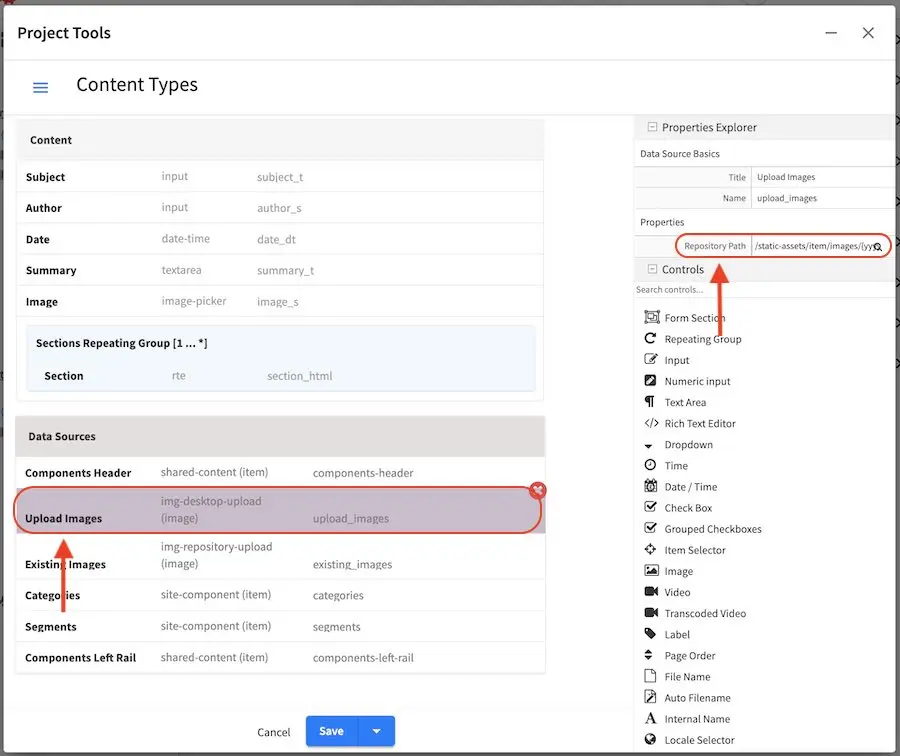
Let’s take a closer look at the value for the Repository Path property. The value listed is:
/static-assets/item/images/{yyyy}/{mm}/{dd}/
where:
{yyyy} inserts the current year when the image is uploaded (4 digit year)
{mm} inserts the current month when the image is uploaded (2-digit month of the year)
{dd} inserts the current day when the image is uploaded (2-digit day of the month)
To take advantage of item specific dependencies for copying and deleting, we will place uploaded items in /static-assets/item/. We added a folder image to better organize our items, since in this location, we will only be storing images. We also used the macros {yyyy}, {mm} and {dd}, again to better organize our image (we can browse by year, or by month, or by date). So, when an image is uploaded from the Desktop say on May 17, 2023, the image will be stored in the following location:
/static-assets/item/images/2023/05/17/
The macros {yyyy}, {mm} and {dd} are available for content modelers to use to better organize their project items. To see other macros available for content modelers, see Macros for Data Sources.
Let’s take a look at item specific dependencies in action for copying and deleting content. Let’s create a new article (Article content type) under one of the article folders in the Sidebar. Enter data in the required fields and remember to upload from desktop an image in the Image field in the Content section. Click on the Save & Close button. Note the location where the image is uploaded.
From the Sidebar, navigate to the newly created article. Right click on the article and select Copy. Navigate to a different folder, right click on the folder and select Paste.
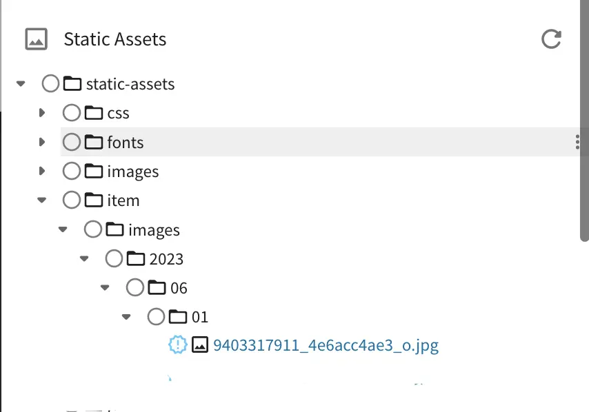
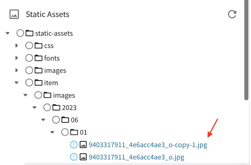
Let’s look at the dependencies of our copied article, where we expect a copy of the image under the /static-assets/item/images/2023/06/01 will be located since we have taken advantage of the item specific dependencies regex pattern of /static-assets/item/*.
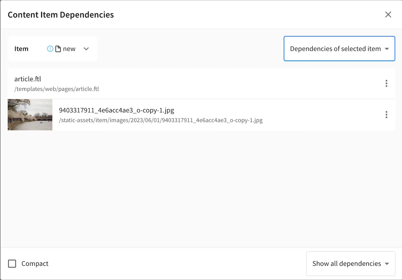
Let’s also take a look at the static-assets folder to see the copy of the uploaded image
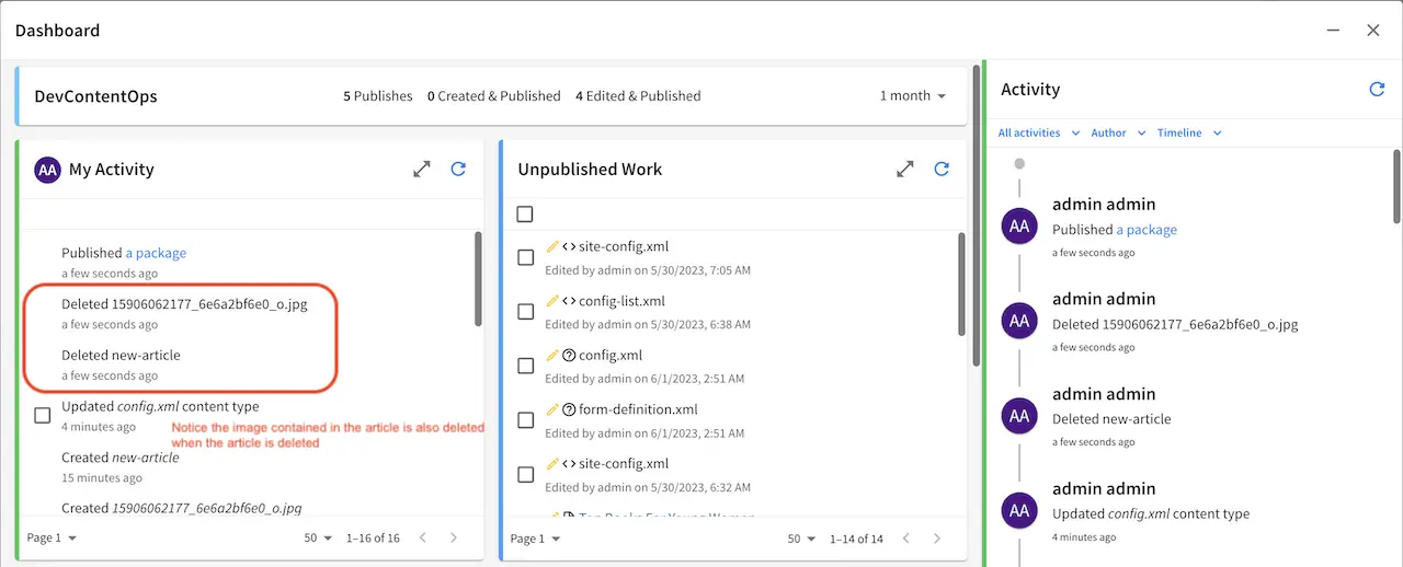
Now let’s take a look at what happens when we delete content with item specific dependencies. From the Sidebar, navigate to the article that we created. Right click on the article and select Delete. Click on the Delete button when the Delete dialog appears. Notice the items that will be deleted when we delete the article.
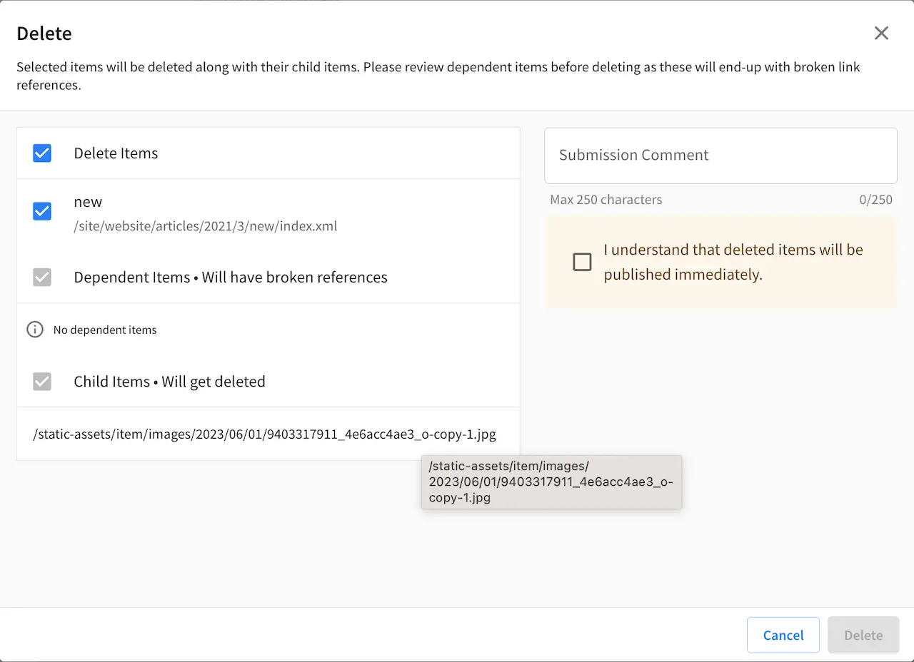
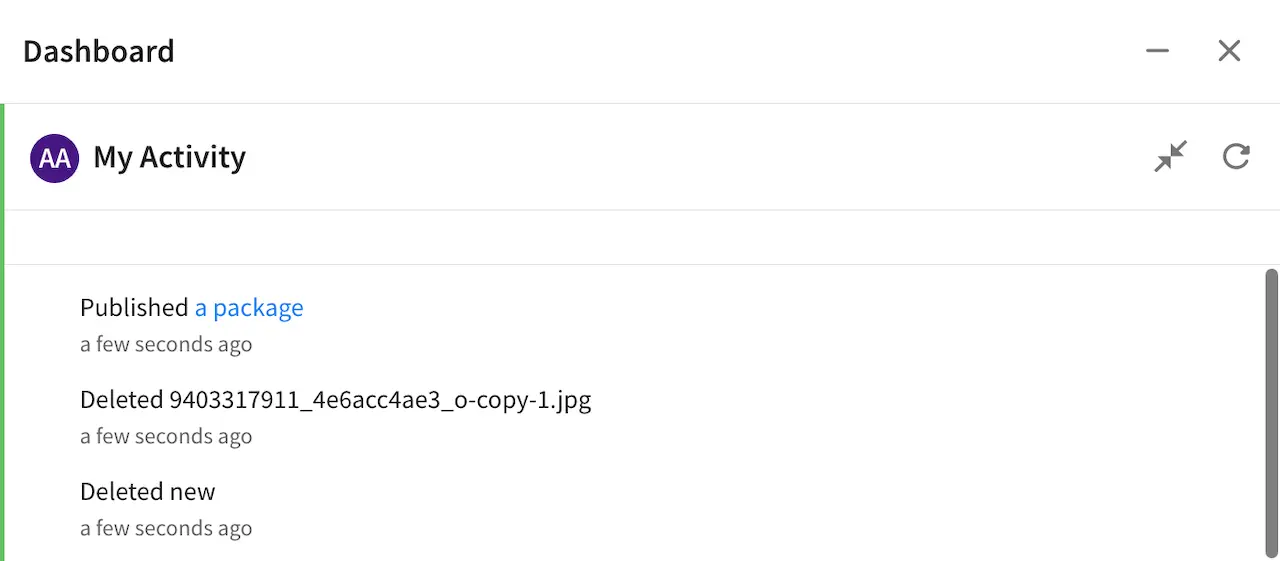
Open the Dashboard and notice the items that are deleted in the My Activity dashlet. We deleted an article, and since the image is located in a path matching the regex pattern for item specific dependencies, the image is deleted along with the article.
Quick Create
Quick create allows content authors to create content with as few clicks as possible through a button from the context nav for configured content types.

Let’s take a look at an example on how to configure a content type to be available from the quick create button in the context nav for authors using the out of the box blueprint Website Editorial. In the image below, we have a project named My Editorial with the quick create button expanded. Notice that we have one content type available for quick create, the Article content type.
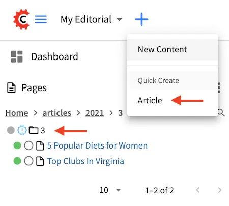
If you look at the site tree as shown above, most of the content (the articles) is organized in a dated folder structure. Adding quick create for the Article content type lets the content author skip having to open the Sidebar, then navigate through the path navigation tree, create the year/month folder if it does not exist yet, then finally create their content.
To setup quick create for a content type, from the Sidebar, click on at the bottom. Next, click on Content Types. We will select the content type Article for editing. Next, go to the Properties Explorer and scroll to the Quick Create section of the properties.
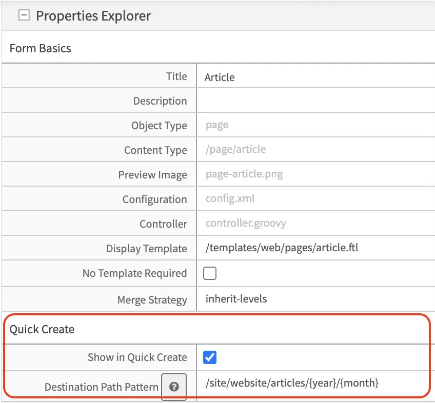
Check the Show in Quick Create property to make the content type available from the quick create button of the Article content type.
In the Destination Path Pattern, fill in the path pattern where the content created from quick create will be stored. For our example, notice that the articles are arranged in the following folder structure:
/articles
  /{year}
    /{month}
We will then put in /site/website/articles/{year}/{month} as the path pattern, which will put the new content into the year and month folder when the content author used quick create.
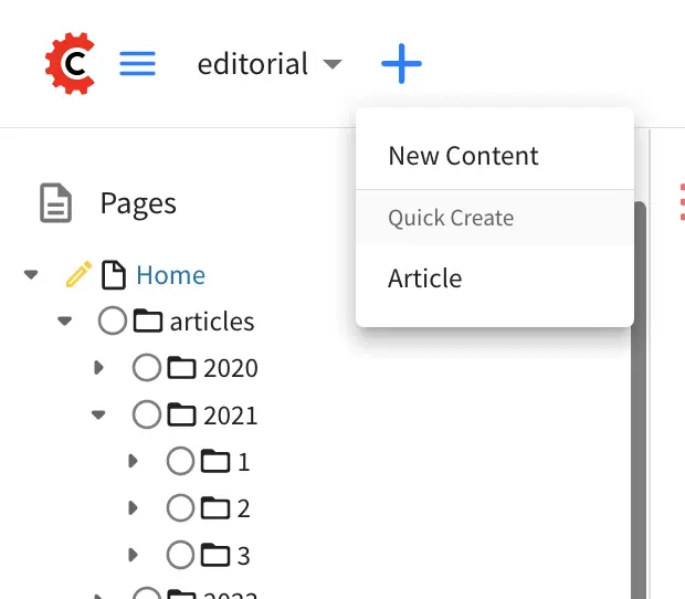
Below is the site tree after using the quick create button to create a new article titled New article using quick create, where the year and month folders were created for the new article using the value in the Destination Path Pattern property of the content type.
Form Controls
Form Controls are data input controls that, once placed on a form, will capture that input from the content authors and store it in the content object. CrafterCMS ships with a number of out-of-the-box controls and you can also create your own by reading Building Form Engine Control Project Plugins.
Each Form Control type has it’s own properties and constraints. Some constraints are common, like “Variable Name” and “Required” while others apply only to the type, e.g. Height and Width limitations on the Image Picker control.
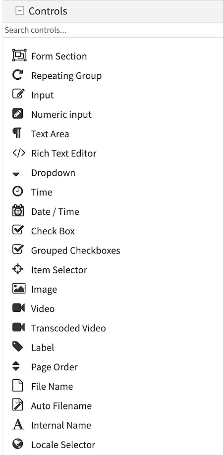
Here’s a list of available Form Engine Controls:
Control |
Description |
|---|---|
|
Create a new section in the form, this is to help the content authors by segmenting a form into sections of similar concern. Details are in the Form Section Control page. |
|
Repeating groups are used when the form has one or several controls that repeat to capture the same data as records. For example: a list of images in a carousel, or a list of widgets on a page. Details are in the Repeating Group Control page. |
|
A simple textual input line. Details are in the Input Control page. |
|
A simple numeric input line. Details are in the Numeric Input Control page. |
|
A simple block of plain text. Details are in the Text Area Control page. |
|
A block of HTML. Details are in the Rich Text Editor Control page. |
|
Dropdown list of items to pick from. Details are in the Dropdown Control page. |
|
Date and Time field with a picker. Details are in the Date/Time Control page. |
|
Time field with a picker. Details are in the Time Control page. |
|
True/False checkbox. Details are in the Checkbox Control page. |
|
Several checkboxes (true/false). Details are in the Grouped Checkboxes Control page. |
|
Item selector from a Data Source. Details are in the Item Selector Control page. |
|
Image selector from a Data Source. Details are in the Image Control page. |
|
Video selector from a Data Source. Details are in the Video Control page. |
|
Transcoded Video selector from Video Transcoding Data Source. Details are in the Transcoded Video Control page. |
|
Displays text. Details are in the Label Control page. |
|
Allows changing the page order. Details are in the Page Order Control page. |
|
A simple text filename. Details are in the Filename Control page. |
|
Details are in the Auto Filename Control page. |
|
Details are in the Internal Name Control page. |
|
Details are in the Locale Selector Control page. |


Form Control Variable Names
Every Form Control has a Variable Name property. The Variable Name is used by the form engine to store the content entered by the user in the content model and search index. This same Variable Name is used later by templates and controllers to retrieve the value.
Variable Name Best Practices
Be descriptive. Well thought out Variable Names help with template and controller readability.
Use camel case. Example: “productSummary”.
Use regex constraints on input boxes to enforce additional validation rules
Do not use Reserved names.
Reserved Variable Names
The following variable names are used by CrafterCMS.
Variable Name
|
Description
|
|---|---|
file-name*
|
Used by the File Name and Auto File Name control.
|
internal-name
|
Used by Crafter Studio to label the content object
|
placeInNav
|
Used by the Page Order control.
|
disabled
|
Used to logically remove an object in content delivery.
For more information, see Disabling a Page
|
expired
|
Used to logically remove an object after date
|
expired_dt
|
Used to logically remove an object after date
For more information, see Content Monitoring
|
objectId
|
UUID. Auto assigned by Crafter
|
objectGroupId
|
First part of objectId. Auto assigned by Crafter
|
createdDate
|
create date. Auto assigned by Crafter
|
createdDate_dt
|
Alternate name for create date. Auto assigned by Crafter
|
lastModifiedDate
|
Last modified date. Auto assigned by Crafter
|
lastModifiedDate_dt
|
Alternate name for last modified date. Auto assigned by Crafter
|
content-type
|
Content type name
|
display-template
|
Path to default template for type
|
merge-strategy
|
Crafter Core/Engine “Merge Strategy” for content type
|
id
|
reserved for a unique identifier
|
authorizedRoles
|
Used to restrict pages based on roles
For more information, see Targeting Using Roles and
Emulating authorizedRoles in XB
|
role
|
Contains the role required to access a page
|
mime-type
|
Mime-type name
|
force-https
|
HTTPS connection needs to be forced to access the page
|
navLabel
|
Navigation label
|
redirect-url
|
Redirect URL
|
crafterSite
|
Used to set the site value
See note in REST Content Retrieval APIs for more information
|
localId
|
Name of the field for paths. Used by the deployer
|
rootId
|
Root Id name. Used by the deployer
|
includedDescriptors
|
Included descriptors field name. Used by the deployer
|
crafterPublishedDate
|
The name for the publish date field. Used by the deployer
|
disableFlattening
|
Used to indicate if XML flattening should be disabled when
indexing XML. Used by the deployer
|
content
|
Used by the deployer
|
contentType
|
Name of field for mimeType. Used by the deployer
|
width
|
Used by the deployer
|
height
|
Used by the deployer
|
contentLength
|
Name of field for file size. Used by the deployer
|
lastEditedOn
|
Name of field for last edit date. Used by the deployer
|
internalName
|
Name of field for internal name. Used by the deployer
|
* Note on file names
CrafterCMS supports the following characters in file and folder names:
Alphanumeric, ,_,-,(,)
as a regex:
[a-zA-Z0-9-_ ()]+
It’s important to point out that Crafter Studio enforces this regex in its UI. However, if you’re working outside of Studio (in your IDE, for example) and you violate these rules, problems may arise downstream, so it’s best to stick the allowed characters.
Variable Names and Search Indexing
CrafterCMS indexes your content in the search index using your content model variable name as the field name.
To facilitate indexing, the following suffix should be appended to variable names depending on the variable data type:
Type |
Field Suffix |
Multivalue Suffix (repeating groups) |
Alternative Multivalue Suffix (for backwards compatibility) |
Description |
|---|---|---|---|---|
integer |
_i |
_is |
_imv |
A 32 bit signed integer |
string |
_s |
_ss |
_smv |
String (UTF-8 encoded string or Unicode). A string value is indexed as a single unit. |
long |
_l |
_ls |
_lmv |
A 64 bit signed integer |
text |
_t |
_txt |
Multiple words or tokens |
|
boolean |
_b |
_bs |
_bmv |
true or false |
float |
_f |
_fs |
_fmv |
IEEE 32 bit floating point number |
double |
_d |
_ds |
_dmv |
IEEE 64 bit floating point number |
date |
_dt |
_dts |
A date in ISO 8601 date format |
|
time |
_to |
_tos |
A time in |
|
text with HTML tags |
_html |
Model fields require their respective data type postfix as listed above. The UI autofills the Name/ Variable Name field and adds postfixes as you’re typing in the Title field.
When setting up reserved variable names for your model, remember to remove the postfix auto-added by the UI since the variable name needs to be exactly the same as listed above.
Remember to also remove the postfix auto-added by the UI when using key or value for your variable names being setup as key-value pairs in a content type, such as the Taxonomy content type used in the Website Editorial blueprint.
Please note that indexed text fields are case insensitive when performing a search, while string fields are case sensitive. Also, queries using string fields will only match full values besides being case sensitive.
If performing a case insensitive search on a string field is desired, CrafterCMS provides a way by enabling tokenization of the field in the content type. To enable tokenization of a string field in Studio, put a check in the checkbox labeled Tokenize for Indexing in the properties section of the content type field. Below is the Article content type in a project created using the Website Editorial blueprint, showing the field Author with the Tokenize for Indexing option:
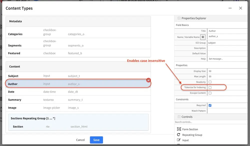
It should also be noted that when the tokenize option is enabled, a second field will be created with the _t postfix. This second field with the _t postfix should be used in queries to be case insensitive and match tokens. In our example above, the field author_t should be used in queries instead of author_s to be case insensitive and match tokens.
Let’s take a look at an example of queries performed on a string field with tokenize enabled and compare the results of using the field with the _s postfix and the second field created when we enabled tokenize with the _t postfix. We’ll use the Author field shown above with Tokenize for Indexing enabled. Here are the results of the queries using the author_s and author_t fields:
Query |
Matches author_s? |
Matches author_t? |
|---|---|---|
Jane |
No |
Yes |
jane |
No |
Yes |
Jane Doe |
Yes |
Yes |
jane doe |
No |
Yes |
Jane doe |
No |
Yes |
Another thing to note is since CrafterCMS stores content as XML files, certain content fields which contain special characters must be escaped. By default, CrafterCMS will escape content fields of types:
HTML (_html)
Text (_t)
String (_s)
Multi-valued string (_smv, _mvs)
Internal-name (internal-name)
This default configuration can be modified by editing the element <cdata-escaped-field-patterns> in the configuration file Project Configuration from the Project Tools -> Configuration
1<!--
2  Specifies the regular expression patterns to match content type field
3  names that require CDATA escaping.
4-->
5<cdata-escaped-field-patterns>
6  <pattern>(_html|_t|_s|_smv|_mvs)$</pattern>
7  <pattern>internal-name</pattern>
8</cdata-escaped-field-patterns>
Data Sources
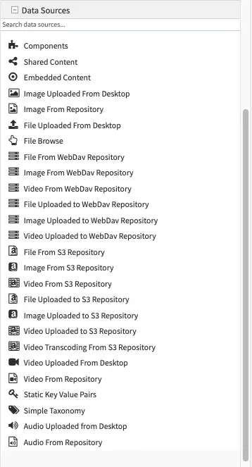
Data Sources are pickers that help pull in content from internal or external storage/systems. For example, data source include: desktop video uploader, desktop image uploader, and so on. CrafterCMS ships with a number of out-of-the-box data sources and you can also create your own by reading Building Form Engine Data Source Project Plugins.
Data Sources allows the content model designer to decide where different assets uploaded via different controls go (for instance icons, images, RTE related assets, etc.). It has it’s own properties, like “Repository Path”, which specifies the path where assets are stored, which help keep the system consistent over time. The storage destination designed in the model dictates how those assets are handled during a duplicate event (duplicate the asset or duplicate the reference to the asset).
Component Handling
There are a couple of data source that also dictates how components are handled during duplicate/copy events. The Shared Content data source will duplicate/copy the reference to a component during a duplicate/copy event and is used for components that need to be shared across pages or components. For components that belong exclusively to a content object, use the Embedded Content data source.
The shared-content data sources also provides an option to allow users to search for existing items (Enable Search Existing property) in addition to browsing. This provides users ease of managing lots of items/assets.
Data sources are usually used in conjunction with a control in the content type, for example, the Item Selector Control is used for selecting files to be uploaded when bound with the File Uploaded from Desktop Data Source data source.
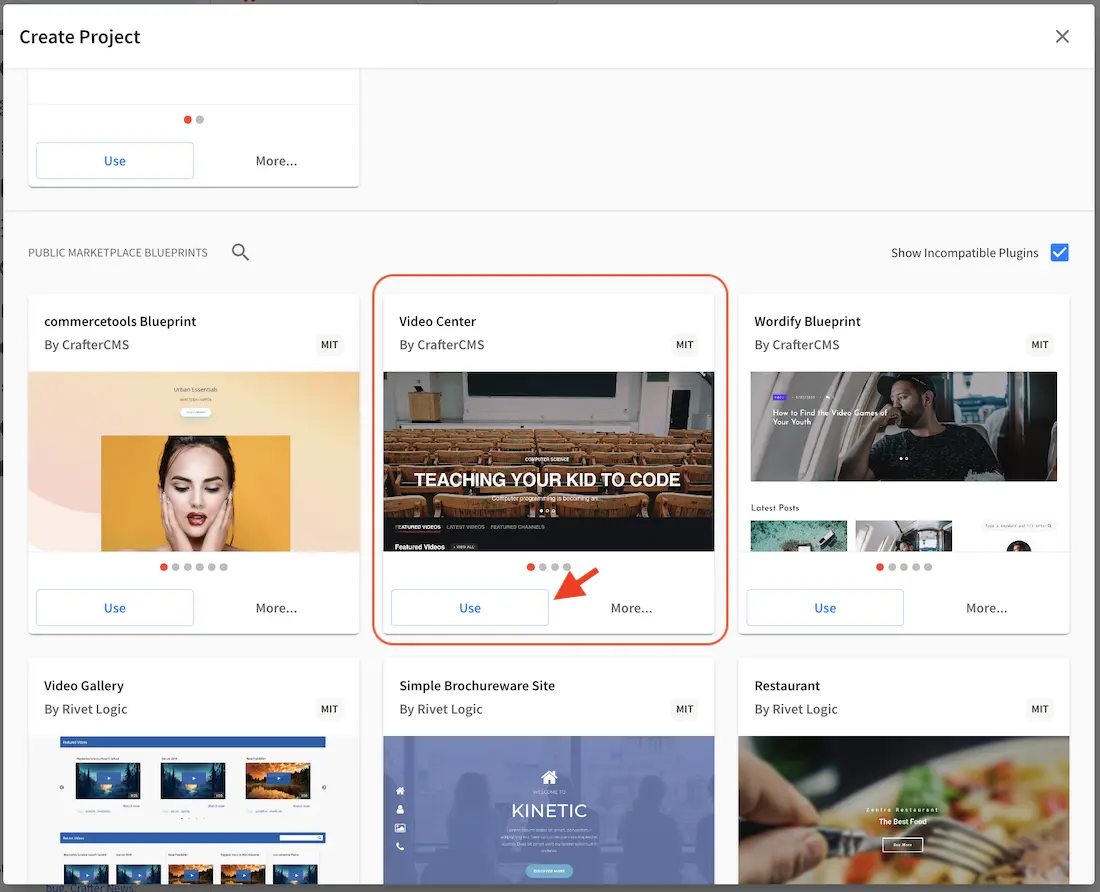
Let’s take a look at a shared content data source in a project created using the Video Center blueprint from the Marketplace.
Open the Sidebar then click on . Click on Content Types and select Stream, then click on the Open Type button. Scroll down to the Data Sources section, then click on Origins, a shared content data source. Notice how a Item Selector Control control is used for selecting shared content Origin. In the Properties Explorer on the right side, put a check mark on Enable Search Existing property so users can search for existing items.
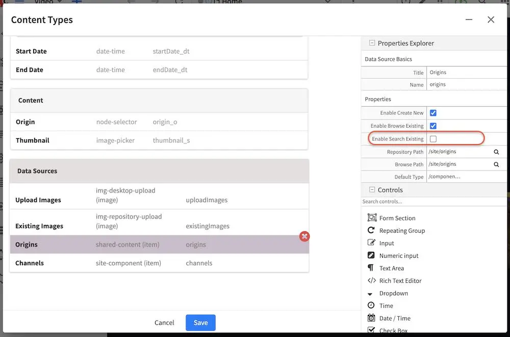
To see the property we setup in action, open the Sidebar, then navigate to /streams. Right click on any of the items, say, AlphaGo, then click on Edit. Scroll down to the Content section of the form. In the Origin field, select the item next to it (ShakaDemo) then click on the x button to remove it. We’ll now add a new one, by clicking on the Add button, then select Search for Existing - Origins.
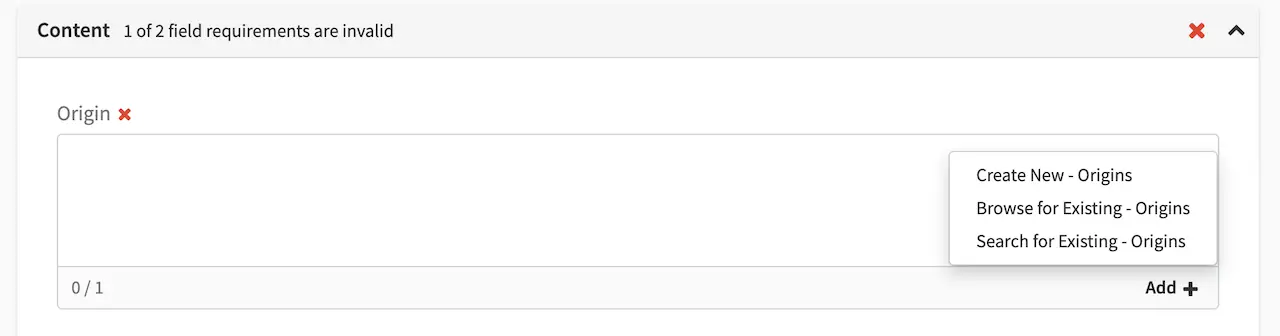
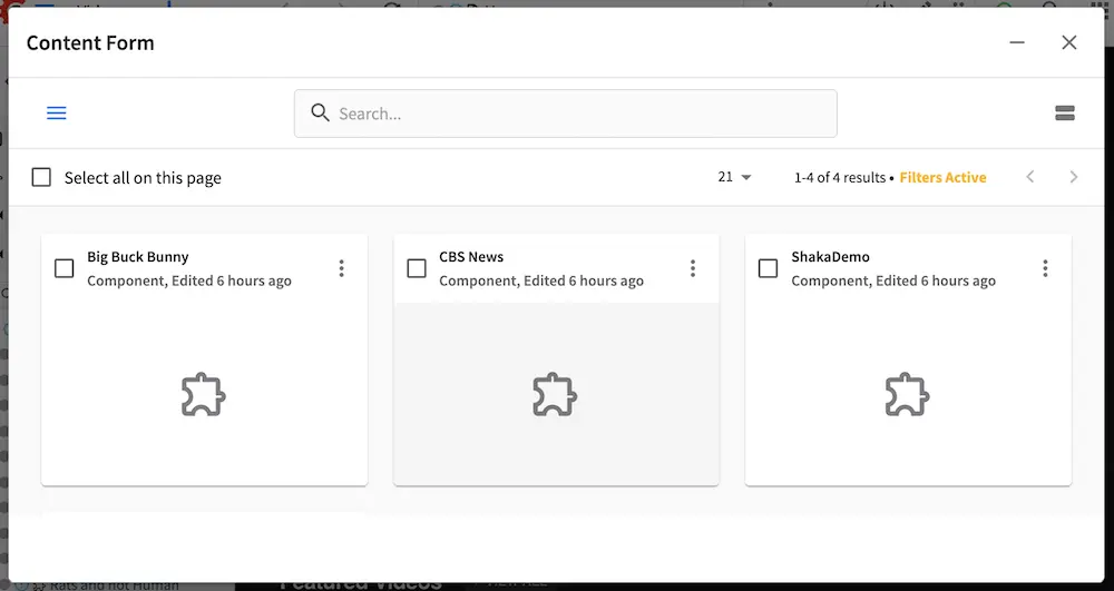
A search dialog will open displaying in a grid view, items the user can search through, select, filter, etc. As we can see, the search option makes it easier for users to pick items instead of scrolling through all the available items, especially for say projects with hundreds or even thousands of items/assets.
Form Engine Data Sources (please use the scrollbar to see more data sources)


Macros for Data Sources
There are a number of macros available for the content model designer to use in data sources. These macros are used when uploading assets to better organize project items, usually in the Repository Path property of the data source for uploading. Here are the available macros:
Macro
|
Description
|
|---|---|
{objectId}
|
Inserts a GUID
|
{objectGroupId}
|
Inserts the first 4 characters of a GUID
|
{objectGroupId2}
|
Inserts the first 2 characters of a GUID
|
{year}
|
Inserts the current year (4 digit year)
|
{month}
|
Inserts the current month (2-digit month of the year)
|
{parentPath}
|
Inserts the parent path of the component/page containing the upload controls
|
{parentPath[index]}
|
Inserts the sub element of a parent path using an index, of the component/page
containing the upload controls
|
{yyyy}
|
Inserts the current year (4 digit year)
|
{mm}
|
Inserts the current month (2-digit month of the year)
|
{dd}
|
Inserts the current day (2-digit day of the month)
|
Data Sources macro: parentPath
Let’s take a look at an example of using the {parentPath} data source macro. We’ll use a project created using
the website editorial blueprint for our example. We’ll be editing the Article content type to add a data source that
will use {parentPath} macro.
Open the Sidebar then click on . Click on Content Types -> Article. Scroll to the
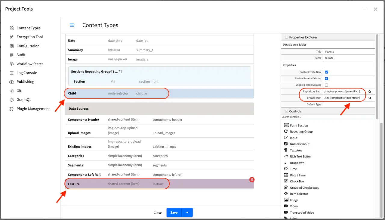
Data Sources section of the form and drag a Shared Content data source into the section. Fill in the Title
and Name fields, then in the Repository Path and Browser Path input /site/components/{parentPath}.
In our example in the image below, the name of the data source is feature. Next, we need to add a control that will
use the data source we just configured. Scroll to the Content section of the form and drag an Item Selector
control into the section. Fill in the Title field, Child for our our example, then in the Item Manager field,
put a check next to Feature, the data source we set up earlier. Save your changes to the content type.
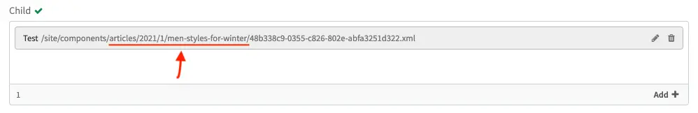
We’ll now use the control and data source we set up and see how the {parentPath} macro works. Recall that we setup
the data source Repository Path to /site/components/{parentPath}. From the project preview, edit one of the articles,
say the article Men Styles For Winter under /articles/2021/1/men-styles-for-winter. Scroll down to the Content
section of the form to the field Child. Click on Add + then select Create New - Feature. Fill in the required
fields then save your changes. Note that {parentPath} is /articles/2021/1/men-styles-for-winter. The newly
created component is now stored in the /site/components/articles/2021/1/men-styles-for-winter folder.
Data Sources macro: parentPath[index]
The parentPath[index] macro provides resolution support for sub elements of a parent path in Crafter Studio.
It pulls a single sub / of the parent path with the following syntax {parentPath[index]}
Here are some examples:
If the parentPath is /en/mypage, then to get the sub element en, use 0 as the index in the macro like so {parentPath[0]}
If the parentPath is /products/household/cleaning then to get the sub element household, use 1 as the index in the macro like so {parentPath[1]}
Note
For both the
parentPathandparentPath[index]macros, the path starts without/site/websiteand/site/components.For example, if in the repository the parent is a page, and the page URL in the repository is
/site/website/en/about-us/index.xml, then the parentPath is/en/about-us/index.xml.If in the repository the parent is a component, and the component URL in the repository is
/site/components/en/products/myproduct.xml, then the parentPath is/en/products/myproduct.xml.Embedded components (and nested embedded components) use the parent path of the top-level (non-embedded) item.
The website_editorial blueprint contains more examples of how the some of the macros listed above are used
when modeling your content, found in the content type Article.
The section Item Specific Dependencies above also details the use of some of the macros in the website_editorial blueprint, content type Article.
Form Canvas
The canvas is where the form actually gets built. The building process is performed by simply dragging the controls from the Form Controls over to the canvas, rearranging the controls in the order you’d like to present to the content authors, and configuring the controls individually.
Controls on the canvas are configured by clicking on the control, and then editing the control’s configuration in the Properties Explorer, see item #3 in Form Builder Basics. Different controls have different configuration, so please review the individual form control configuration listed in Form Controls.
Two controls have a special significance to the form canvas: Form Section Control and Repeating Group Control. Form Section Control creates a form section that can be expanded and collapsed and holds within it other controls. This is typically used to group together controls that cover a similar concern and help provide the content authors with a clear and organized form when editing in form mode. Like the Form Section Control, Repeating Group Control is also a container that holds other controls, but the purpose is to allow a set of controls to repeat as configured. This is typically used to allow content authors to enter a set of meta-data and repeat it as many times as desired and permitted by configuration.
The canvas allows the form-based content capture only, and is used by content authors when they’re in that mode. In-Context Editing will leverage the form components, but not the canvas when authors are in that mode. Learn more about In-Context Editing configuration for projects Experience Builder (XB) .
Content Type Form Controllers
Content type form controllers are scriptable lifecycle event handlers that let you run custom logic either:
On the client side (in the form on load, on save and other events)
On the server side (during content write/delete operations in the backend)
Form controllers are ideal for scenarios that require automation or custom validation across multiple fields, or when external information is needed before publishing content. Examples include:
Synthesizing new values from existing fields
e.g., automatically generating a slug from a title.Tying two fields together
e.g., If one field changes, update another field dynamically.Validating content
e.g., Querying a remote system to verify a value before saving.Blocking saves if the custom validation rule fails.
You can use the client side and server side controller together to ensure that the data submitted from the client-side
is validated and processed correctly on the server side. For instance, you might validate user input in
form-controller.js and then perform additional checks or transformations in controller.groovy.
Client-Side Form Controllers
Client-side controllers or form engine controllers allows you to define custom logic that executes during specific events, such as when the form loads or before saving. For example, you might want to validate a field or dynamically update another field based on user input.
To add a client side controller, do the following:
Open the content type you wish to add a form controller in Studio via the
Content Typestool underProject ToolsIn the
Properties Exploreron the right side, look for theConfigurationfield. This field contains theconfig.xmlfile which holds information about the content type such as the limit where content can be created, is it previewable, etc. Click on the field then click on the pencil icon in the field to edit the configuration.Add a
<controller>tag if not already in the configuration and set the value totrueto enable the client-side controllerEnabling loading of form-controller.js via the config.xml file¶<content-type name="/page/article" is-wcm-type="true"> <label>Article</label> <form>/page/article</form> <form-path>simple</form-path> ... <!-- Specifies whether a form-controller.js is present in the type definition and should be loaded by the Forms Engine --> <controller>true</controller> ... </content-type>
Add your
form-controller.jsfile to the content type definition folder located in:CRAFTER_HOME/data/repos/sites/<PROJECT_NAME>/sandbox/config/studio/content-types/<CONTENT-TYPE-NAME>/Remember to add and commit your new
form-controller.jsfile so Studio is aware of the change.
Example
Let’s now look at an example where you want to ensure the Internal Name always ends with an asterisk (*).
We’ll use a project named Hello created in Studio using the Empty blueprint and we’ll add the form controller
to the Entry content type.
First, we’ll enable client-side controller to the content type by opening the sidebar in Studio then clicking on
Project Tools -> Content Types -> Entry, then click on the Open Type button. On the right side of the
screen under Properties Explorer, click on the Configuration field then click on the pencil icon to edit the
config.xml file
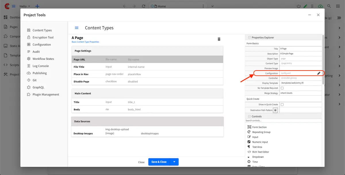
We’ll now enable the controller by adding a <controller> tag in the configuration and set the value to true
then save our changes.
Enable controller in the configuration file (config.xml) for the Entry content type
 1<content-type name="/page/entry" is-wcm-type="true">
 2    <label>Entry</label>
 3    <form>/page/entry</form>
 4    <form-path>simple</form-path>
 5    <model-instance-path>NOT-USED-BY-SIMPLE-FORM-ENGINE</model-instance-path>
 6    <file-extension>xml</file-extension>
 7    <content-as-folder>true</content-as-folder>
 8    <previewable>true</previewable>
 9    <quickCreate>false</quickCreate>
10    <quickCreatePath></quickCreatePath>
11    <noThumbnail>true</noThumbnail>
12    <image-thumbnail>image.jpg</image-thumbnail>
13    <!-- Specifies whether a form-controller.js is present in the type definition and should be loaded by the Forms Engine -->
14    <controller>true</controller>
15</content-type>
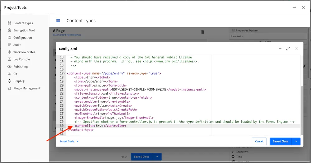
The next step is to write a form-controller.js script. We’ll put the file under the folder:
CRAFTER_HOME/data/repos/sites/hello/sandbox/config/studio/content-types/page/entry
 1CStudioForms.FormControllers.PageEntryController = CStudioForms.FormControllers.PageEntryController ||  function() {};
 2
 3YAHOO.extend(CStudioForms.FormControllers.PageEntryController, CStudioForms.FormController, {
 4
 5    onBeforeSave : function () {
 6        var internalName = this.form.model['internal-name'];
 7        if(!internalName.endsWith("*")) {
 8            this.form.model['internal-name'] =  internalName + '*'
 9        }
10
11        return true
12    }
13});
14
15CStudioAuthoring.Module.moduleLoaded("/page/entry-controller", CStudioForms.FormControllers.PageEntryController );
Note that the last line in the script informs the system that the controller is loaded and associates the name of the content type (-controller) with the class.
Finally, we’ll add and commit our new file form-controller.js so Studio is aware of the changes:
$ cd CRAFTER_HOME/data/repos/sites/hello/sandbox/
$ git add config/studio/content-types/page/entry/form-controller.js
$ git commit
In the onBeforeSave() method, we check if the value ends with an asterisk *; if not, append it.
This all happens before the save request is sent to the server.
The result? Users save their content normally, but your rule ensures the formatting is always correct.
Server-Side Form Controllers
Server-side controllers or content lifecycle controllers allow you to run custom logic during content write/delete
operations in the backend. It’s automatically wired in through the content type controller.groovy file.
The controller.groovy file lets you:
Inspect the content, user, path, type, and lifecycle operation (create/update/move/etc).
Run logic before the save completes, such as integration calls, data checks, or transformations.
Block, modify, or enhance the save process without touching the UI.
To access the controller.groovy script from Studio:
Open the content type you wish to add a form controller in Studio via the
Content Typestool underProject ToolsIn the
Properties Exploreron the right side, look for theControllerfield. This field contains thecontroller.groovyfile. Click on the field then click on the pencil icon in the field to edit the script.
Example
Let’s take a look at an example of a controller script that logs the lifecycle event type create, update, etc.
to the server console. We’ll use a project named Hello created in Studio using the Empty blueprint and we’ll
edit the controller controller.groovy of the Entry content type.
First, we’ll open the controller.groovy script of the content type by opening the sidebar in Studio then clicking on
Project Tools -> Content Types -> Entry, then click on the Open Type button. On the right side of the
screen under Properties Explorer, click on the Controller field then click on the pencil icon to edit the
controller.groovy file
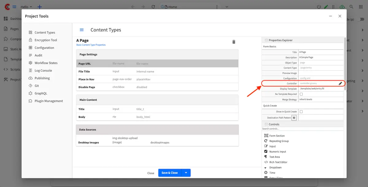
We’ll now edit the controller to log lifecycle events by adding
Log lifecycle events
import scripts.libs.CommonLifecycleApi

def contentLifecycleParams =[:]
contentLifecycleParams.site = site
contentLifecycleParams.path = path
contentLifecycleParams.user = user
contentLifecycleParams.contentType = contentType
contentLifecycleParams.contentLifecycleOperation = contentLifecycleOperation
contentLifecycleParams.contentLoader = contentLoader
contentLifecycleParams.applicationContext = applicationContext

def controller = new CommonLifecycleApi(contentLifecycleParams)
controller.execute()

System.out.println("Server side content lifecycle event : " + contentLifecycleOperation)
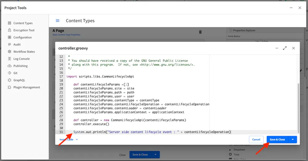
Save your changes to the controller.groovy file, then edit some content in your project using the content type you
just edited. Once your changes have been saved, watch your logs and notice the entry made when we updated content:
[INFO] 2025-08-20T10:32:35,265 [pool-23-thread-1] [ed] [context.SiteContext] | GraphQL schema build completed for site 'hello' in 0 secs
Server side content lifecycle event : UPDATE
Content Type View Templates
View templates control how the model is rendered as HTML. Crafter uses FreeMarker as the templating engine, and provide the full model defined by the model in the previous section. Every element in the model is accessible to the view template via a simple API ${contentModel.VARIABLE_NAME} where variable name is the Name / Variable Name definition in the Form Control. View templates are primarily written in HTML, backed by CSS with API calls weaved within to pull content from the primary CrafterCMS model or additional model (via APIs, please read Groovy/Java API for that topic).
An example view template
 1<#import "/templates/system/common/crafter.ftl" as crafter />
 2
 3<!DOCTYPE html>
 4<html lang="en">
 5  <head>
 6    <!-- Basic Page Need
 7    ================================================== -->
 8    <meta charset="utf-8">
 9    <title>${contentModel.browser_title}</title>
10    <meta name="description" content="${contentModel.meta_description}">
11    <meta name="keywords" content="${contentModel.meta_keywords}">
12    <@crafter.head/>
13  </head>
14  <body>
15    <@crafter.body_top/>
16    <div class="body" <@studio.iceAttr iceGroup="body"/>>
17      ${contentModel.body_html}
18    </div>
19
20    <#if (contentModel.analytics_script)??>${contentModel.analytics_script}</#if>
21
22    <@crafter.body_bottom/>
23  </body>
24</html>
The simple example renders a simple HTML page with a very basic model. Let’s review the model first:
Model Element
|
Control
|
Purpose
|
browser_title
|
Input
|
Provide a browser title for the page
|
meta_keywords
|
Input
|
SEO keywords associated with the page
|
body_html
|
Rich Text
Editor
|
The page’s main HTML body (in this case, it’s
just a static HTML block).
|
analytics_script
|
Text Area
|
Analytics’s Engine JavaScript
|
The FreeMarker language is supported. For detailed Freemarker documentation, please visit: http://freemarker.org
Page and Component Controller (Page and Component Scripts) Definition
Crafter page and components can have their own controller scripts too, that are executed before the page or component is rendered, and that can contribute to the model of the template. Learn more about page and script controllers in Page and Component Controllers.
Creating Content Type Examples
Page Content Type Example
Page content types are top level container types that lets you define the layout/structure and functionality of content/components. To create a new page content type, click on from the Sidebar
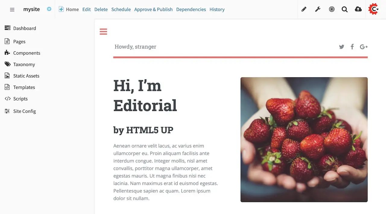
Click on Content Types, then select Create New Type
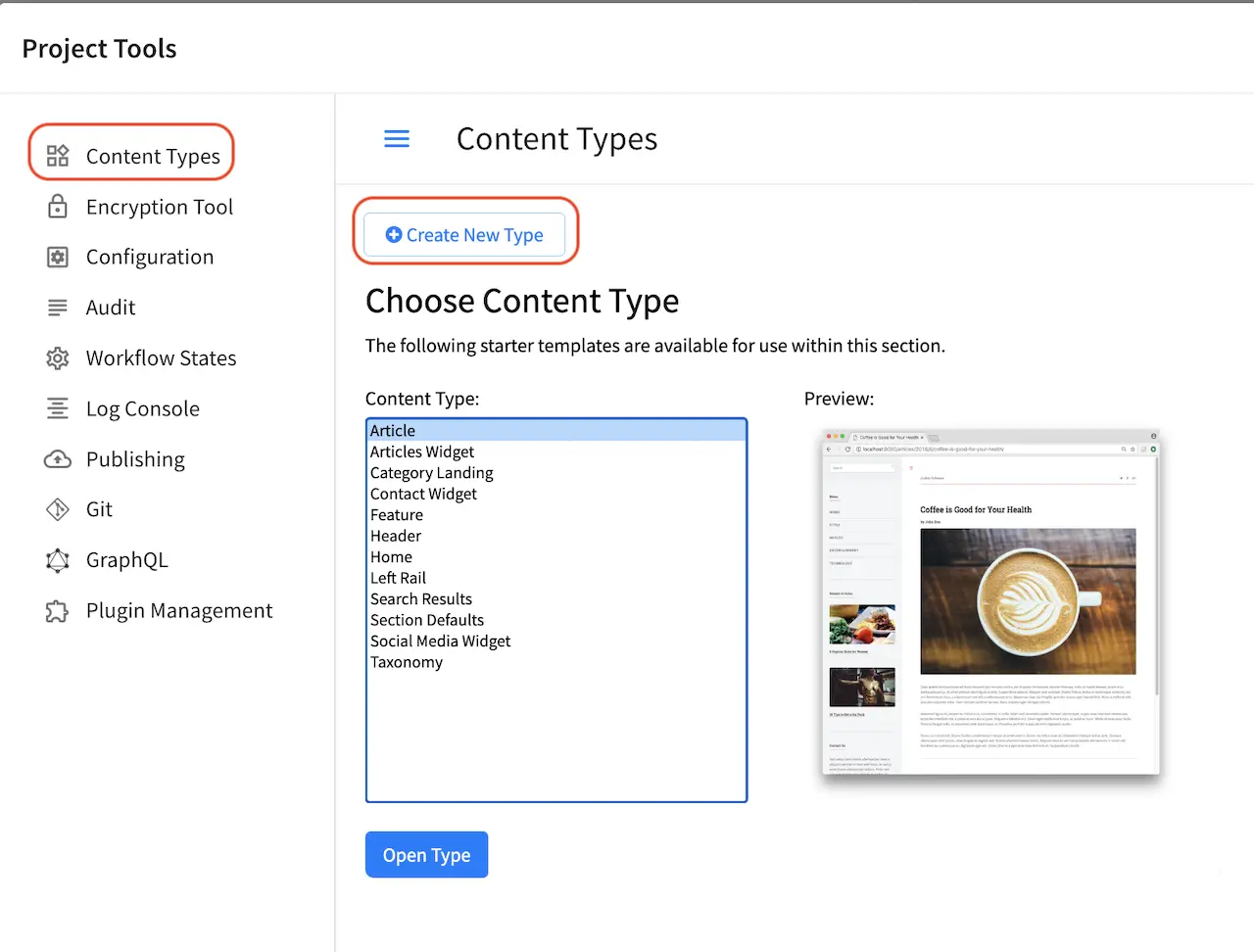
Enter a Display Label and content type name for your new page content type, then select Page as Type and then click on the Create button
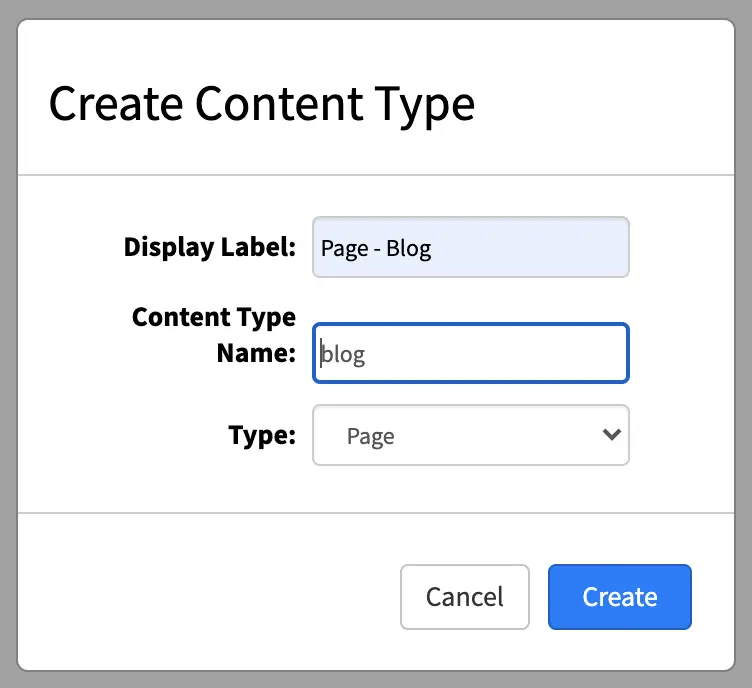
We’ll now start to construct the layout of the page. A content type has three ingredients: the model, the view and the controller.
Model
We’ll start building the model first, which is the form that Authors will be using to enter content into. We’ll add a form section called Content to the form and name it accordingly.
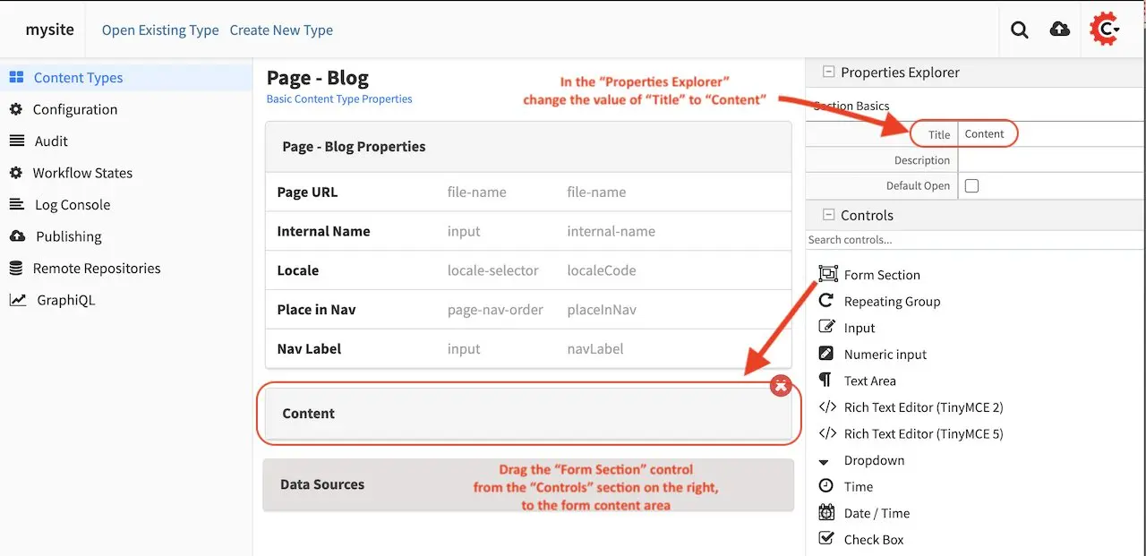
We’ll add a few more things to our model by dragging controls and data sources to the form. We’re creating a page template for a blog entry, so at a minimum, we’ll add some input fields for the title and author names, a date/time field, an image picker and it’s corresponding data sources and a rich text editor inside a repeating group control so Authors can add as many sections as they want.
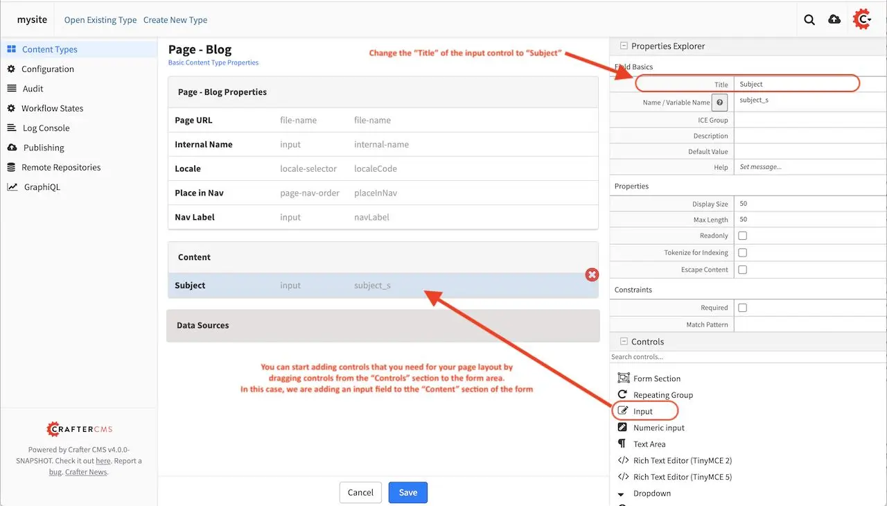
Here we’re adding an image picker to the form. Notice that we’ll need to add data sources for the image picker to get images from. There are at least two sources that the image picker can get images from. One is from images uploaded from the desktop, the other is for existing images listed in the Static Assets folder in the Sidebar.
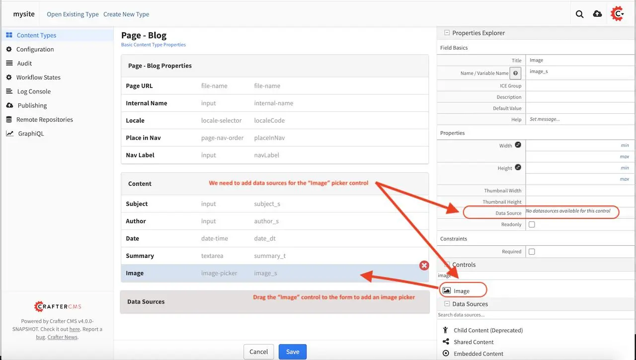
We’re now going to add a data source for our image picker, by dragging the Image Uploaded from Desktop from the Data Sources list on the right to the form in the section Data Sources. Don’t forget to enter the path where to store the new image uploaded from desktop in the Repository Path field under the Properties Explorer
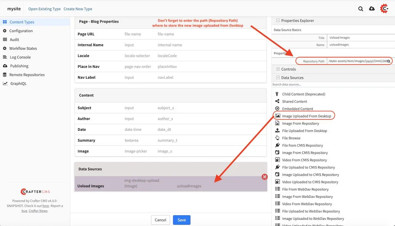
We’ll also add the data source Image From Repository by dragging it to the Data Sources section in the form. Don’t forget to add the path where to browse existing images from the repository
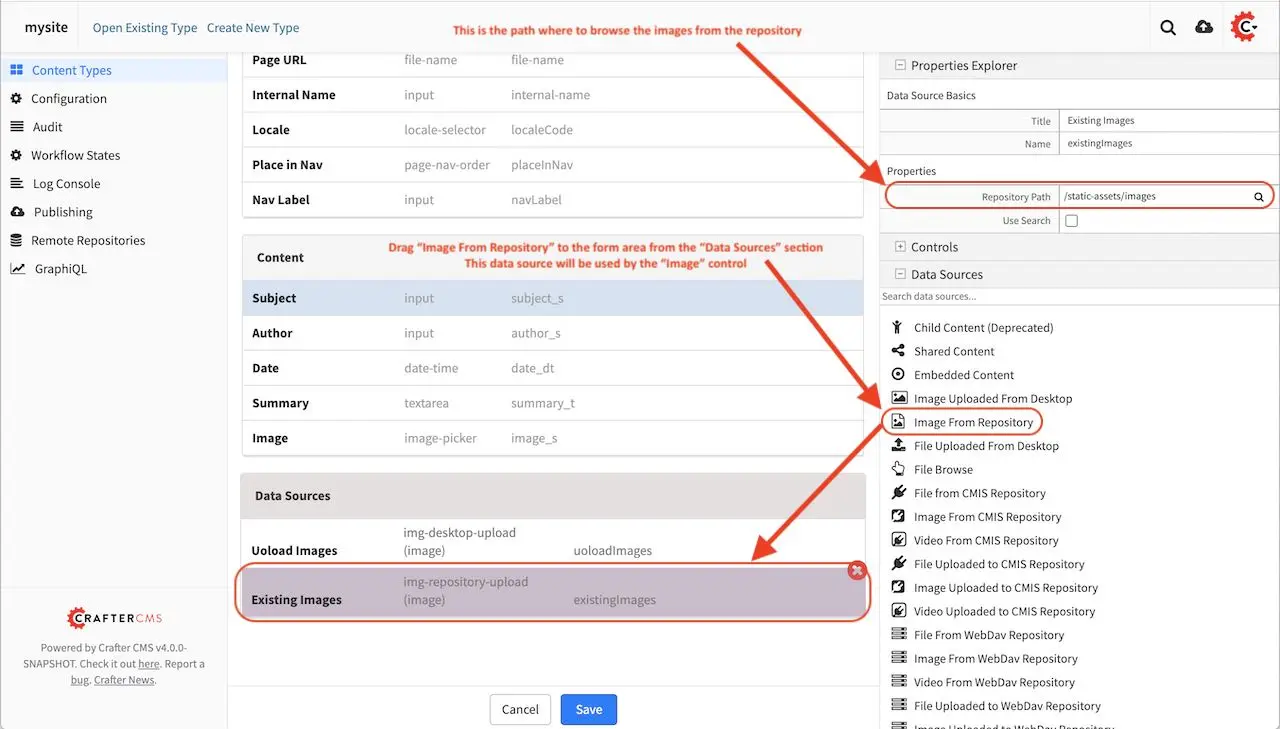
We’ll go back to the Image Picker control on the form to make sure the two data sources we added are checked as sources for the Image Picker
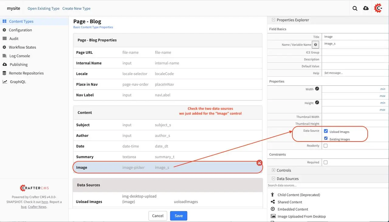
We’ll be adding a header component and a left-rail component inherited from the home page. To add a component to the form, drag the Item Selector control to the form in the Page - Blog Properties section. We’ll be adding two components to the form, one for the Header and one for the Left-rail
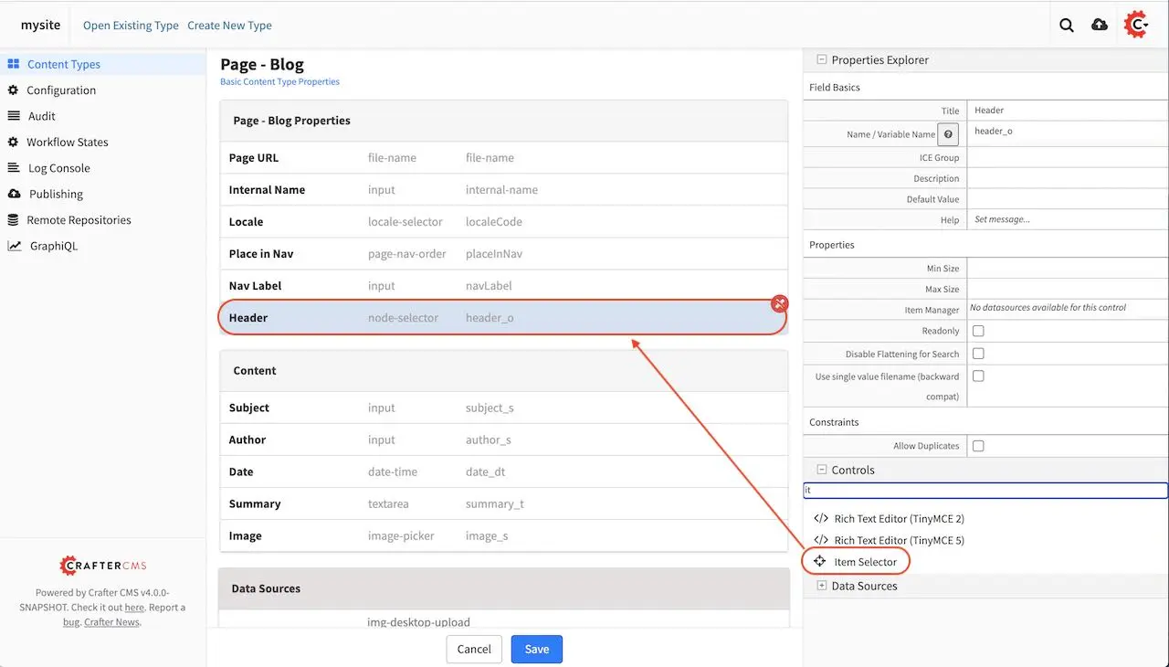
We’ll need to add a data source for the two Item Selectors we just added to the form by dragging Shared Content to the Data Sources section to the form and naming it Components. Don’t forget to add the path where to store new content created under the Repository Path field in the Properties Explorer.
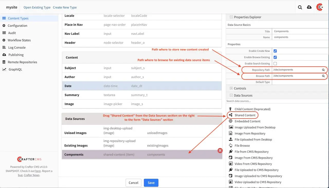
We’re going back to the Item Selectors we added to the form and check Components as data source for our control
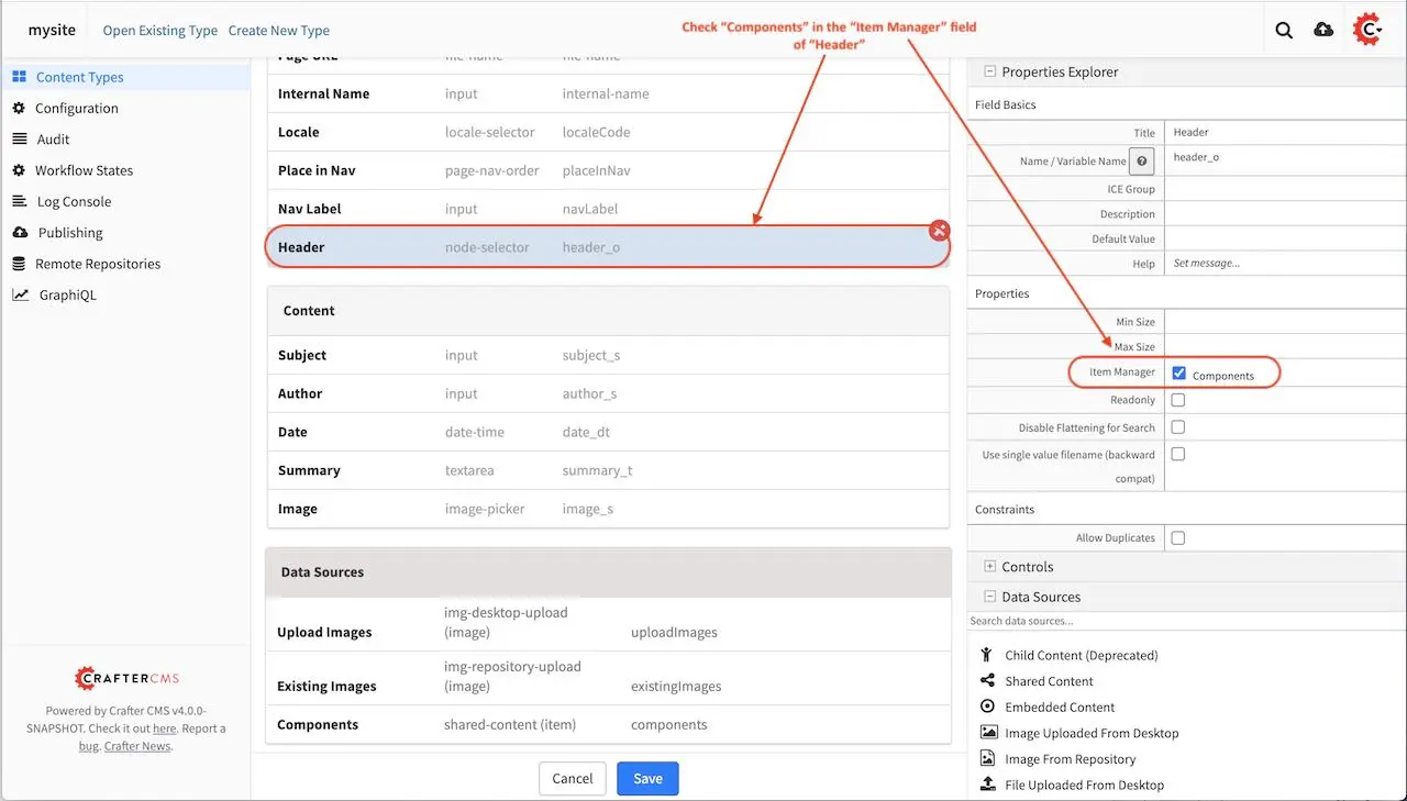
Next we’ll add a Repeating Group control to the form, with a minimum of 1 occurrence, which can be specified in the Properties Explorer section, in the Minimum Occurrences field
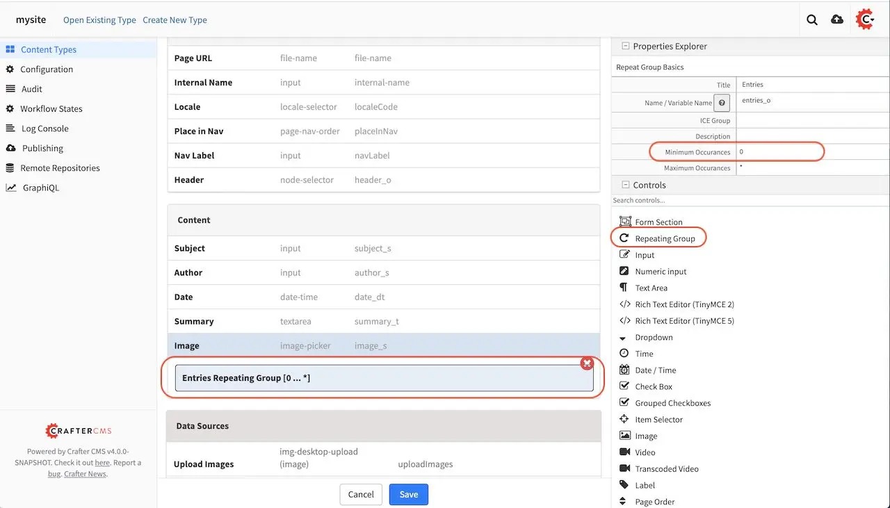
In the Repeating Group control, we will add an RTE (Rich Text Editor). In order for the content to be searchable, it needs to be indexed. To facilitate indexing, the suffix _html should be appended to the variable name given to the RTE. In this case, the RTE’s variable name is entry_html. For more information on variable names and search indexing , please see the section Form Control Variable Names
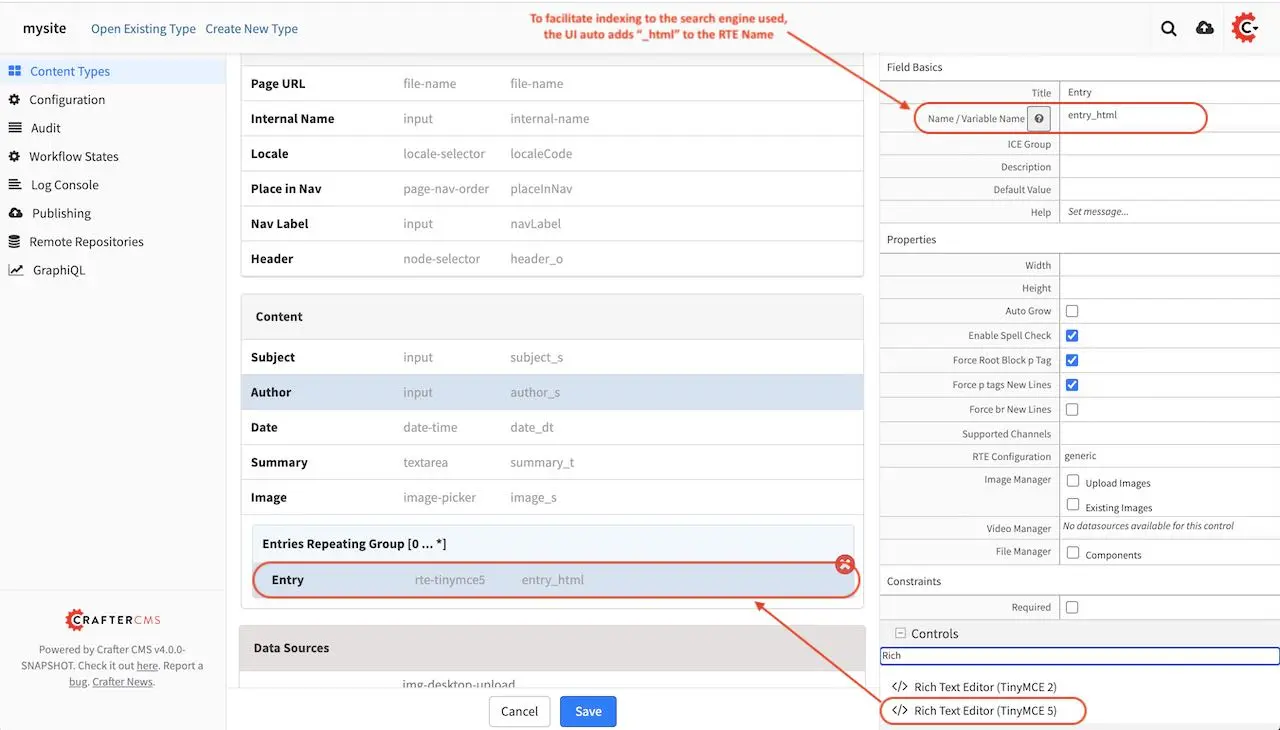
The model for our template is done. You can add some other controls by dragging and dropping controls from the Controls section to the form. To learn more about all the controls available, please see Form Controls. To learn more about the data sources available, please see Data Sources.
View
We’ll now build the view for our template, which is the freemarker template file that renders the content, typically to HTML markup. There are two ways to create the freemarker template file for our template. One way is to open the Sidebar menu in Studio, then navigate to the Templates folder, depending on how your project is setup, you may want to navigate to the subfolder in your Templates folder where you want to create the freemarker template file. Once you are in the desired subfolder, right click on that folder then select Create Template
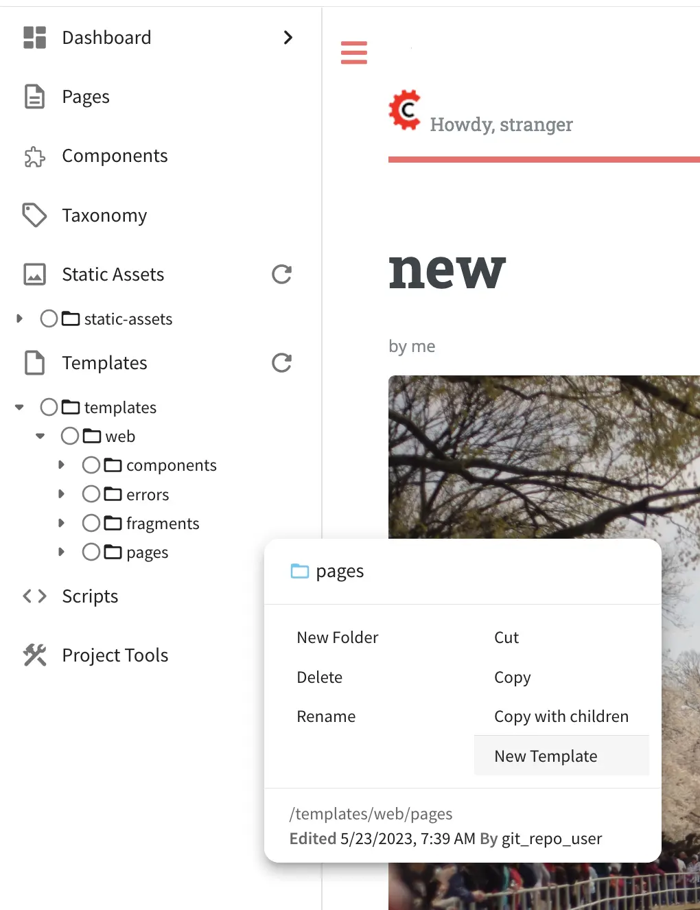
The other way of creating your freemarker template, is to go to the Properties Explorer in the Content Type model, then click on the Display Template field, a magnifying glass and a pencil will appear on the field. To create a template, click on the pencil.
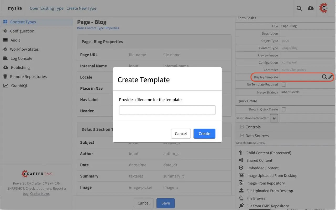
Either way of starting to create your new ftl template, a Create Template dialog will appear. It will then ask you for a filename for the freemarker template you’re creating, then click on the Create button.
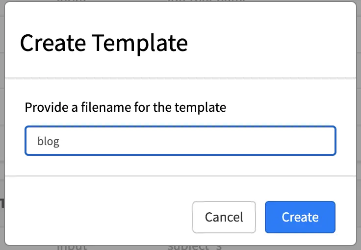
A dialog will appear with a blank template.
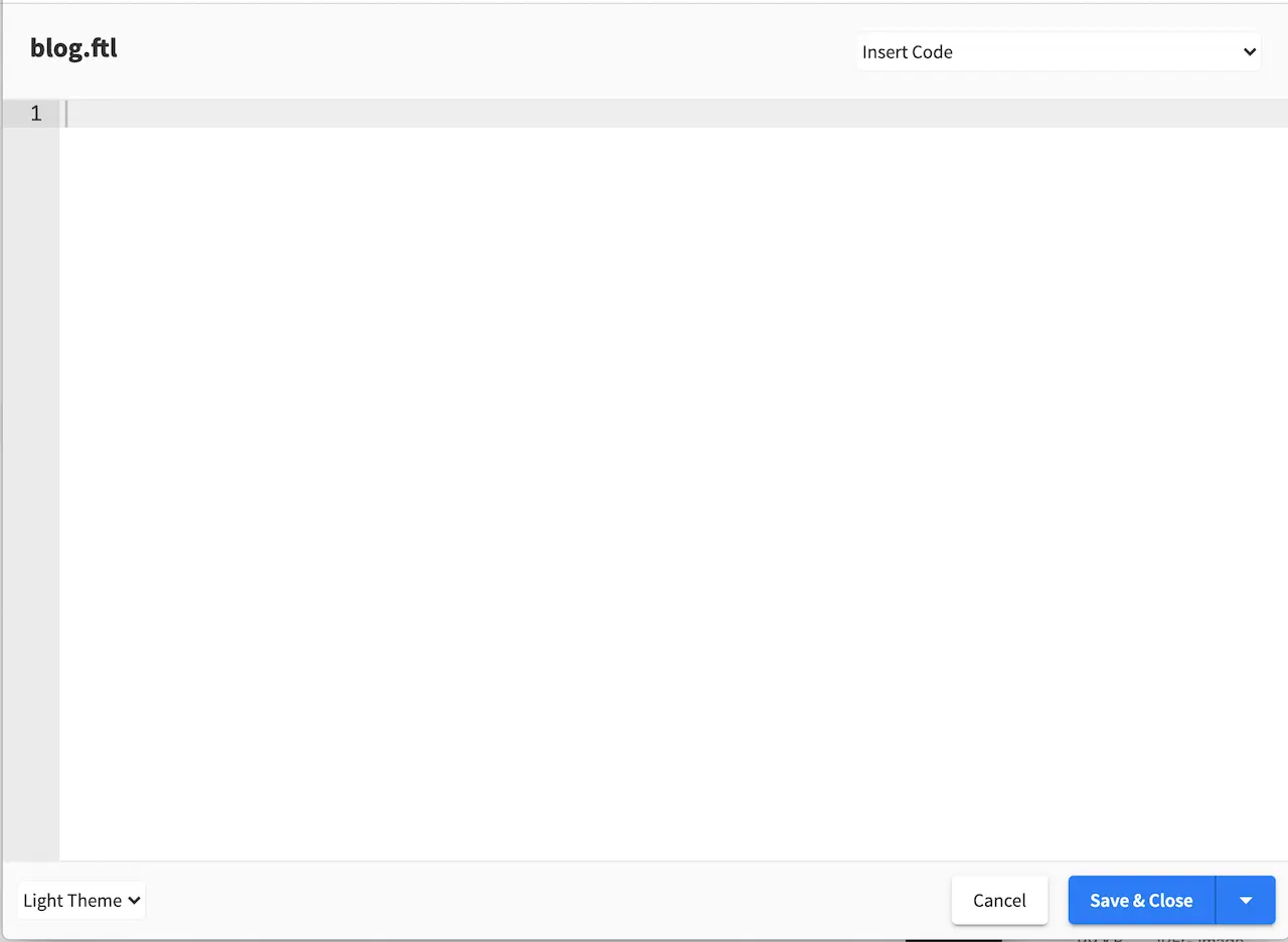
At the top right of the dialog, you can use some Template code examples from a drop down list with the caption Insert Code. Here’s the list of available template code examples.
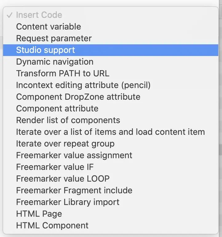
For the template we are creating, we will select Studio support from the drop down list to enable authoring support.
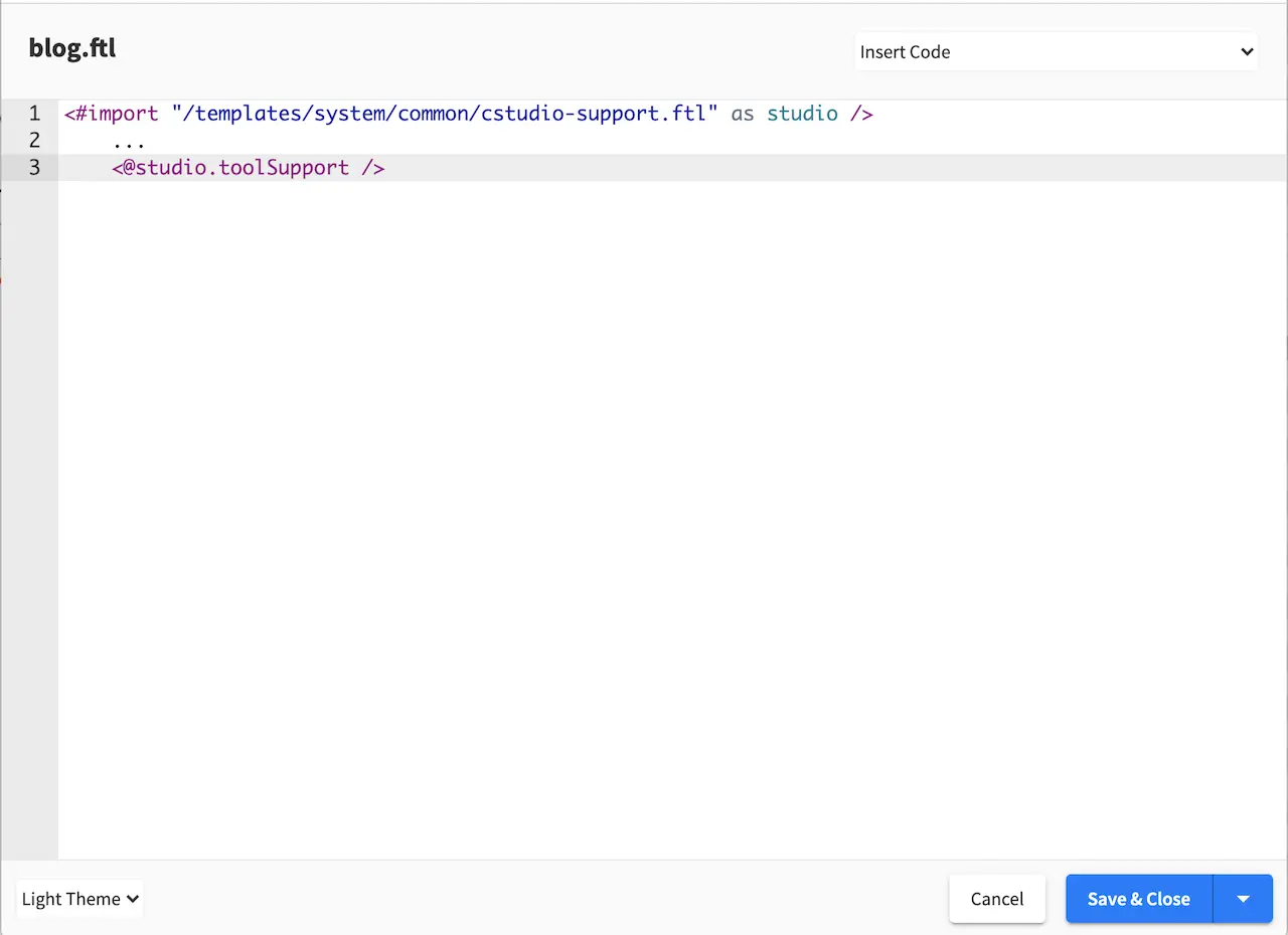
We will now start filling in the template of how we want the content captured in the model is rendered to html in this case. In the image below, we render the header component and the other fields in the Content section of our model. Please note how fields in the model are rendered through the FTL template. To learn more, please see the section FreeMarker (Templating) API
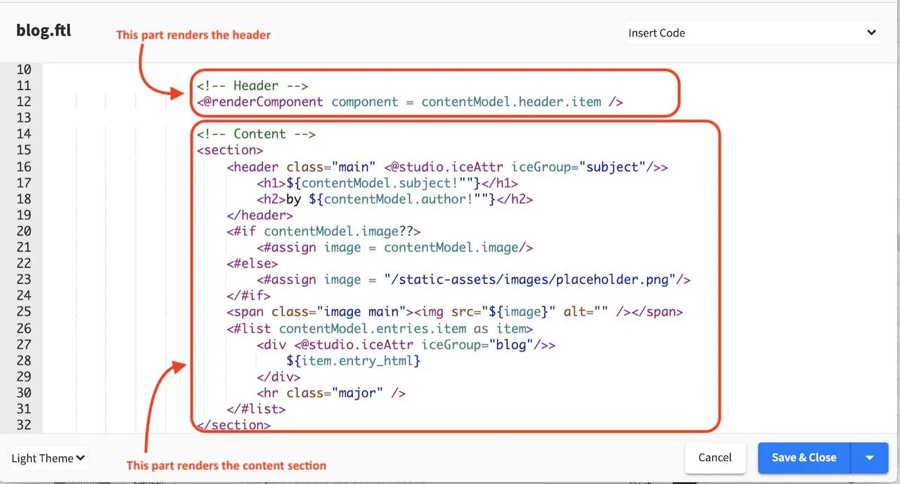
<!-- Header -->
    <@renderComponent component = contentModel.header.item />
 1<!-- Content -->
 2  <section>
 3    <header class="main" <@studio.iceAttr iceGroup="subject"/>>
 4      <h1>${contentModel.subject!""}</h1>
 5      <h2>by ${contentModel.author!""}</h2>
 6    </header>
 7    <#if contentModel.image??>
 8      <#assign image = contentModel.image/>
 9    <#else>
10      <#assign image = "/static-assets/images/placeholder.png"/>
11    </#if>
12    <span class="image main"><img src="${image}" alt="" /></span>
13    <#list contentModel.entries.item as item>
14      <div <@studio.iceAttr iceGroup="blog"/>>
15        ${item.entry_html}
16      </div>
17      <hr class="major" />
18    </#list>
19  </section>
Controller
A controller is not necessary for a content type. To show how to create a controller for our new content type, we will create a custom controller. In the preceding section, we created a new content type (template) Page - Blog. We will now add a couple of featured articles at the bottom of the page depending on the active segment set in targeting. To be able to display articles depending on the active segment set, we will need to get a list of articles tagged for the active segment. This can be done by adding a script that gets executed to get the list of articles tagged for the segment selected before the page is rendered.
Open the Sidebar menu and navigate to the Scripts folder. Click on the Scripts folder then scripts. Right click on the folder pages, then select Create Controller
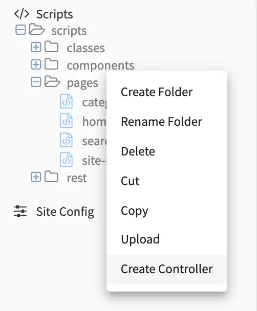
Enter a name for the controller, then click on the Create button. Since we are creating this controller for our Page-Blog template, we will name the script blog.groovy. Putting the script under scripts->pages and naming it after the page content type, binds the script to our page.
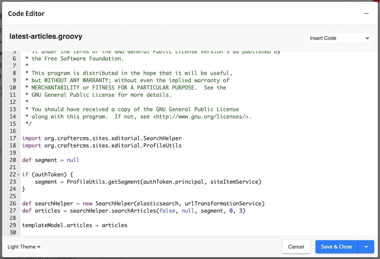
We can now start adding the script to get a list of articles depending on the active segment.
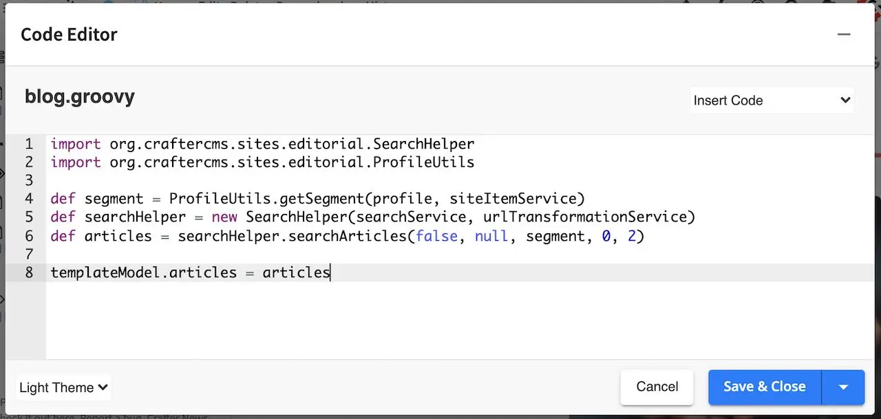
1import org.craftercms.sites.editorial.SearchHelper
2import org.craftercms.sites.editorial.ProfileUtils
3
4def segment = ProfileUtils.getSegment(profile, siteItemService)
5def searchHelper = new SearchHelper(searchClient, urlTransformationService)
6def articles = searchHelper.searchArticles(false, null, segment, 0, 2)
7
8templateModel.articles = articles
There are two ways to bind a script/controller to a page/component. The first way, as we have seen is to put the script under Scripts->Pages or Scripts->Components, and name the script after the page or component type. We’ll show the other way how to bind a script to a page/component in the next section Component Content Type Example
To find out more about page and component scripts, please see Page and Component Controllers.
Now that we have our controller, we just need to add code to the freemarker template (view) to display the list of articles returned by the script.
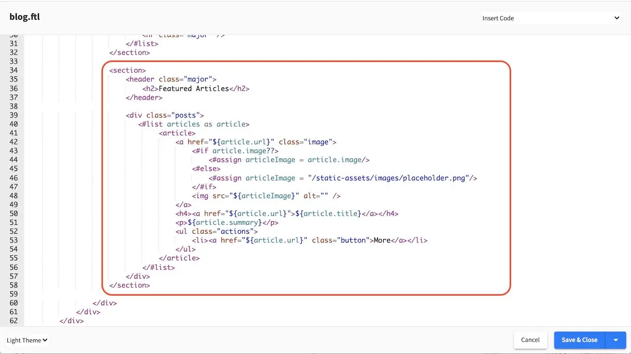
 1<section>
 2  <header class="major">
 3    <h2>Featured Articles</h2>
 4  </header>
 5
 6  <div class="posts">
 7    <#list articles as article>
 8      <article>
 9        <a href="${article.url}" class="image">
10          <#if article.image??>
11            <#assign articleImage = article.image/>
12          <#else>
13            <#assign articleImage = "/static-assets/images/placeholder.png"/>
14          </#if>
15          <img src="${articleImage}" alt="" />
16        </a>
17        <h4><a href="${article.url}">${article.title}</a></h4>
18        <p>${article.summary}</p>
19        <ul class="actions">
20          <li><a href="${article.url}" class="button">More</a></li>
21        </ul>
22      </article>
23    </#list>
24  </div>
25</section>
As you can see from the controller we just added, the controller is used to customize your page by enabling you to run a script before the page is rendered. To find out more about groovy APIs in CrafterCMS, please see the section Page and Component Controllers.
Component Content Type Example
Component content type templates are very similar to page content type templates, as mentioned in Content Modeling, the only difference between components and pages is that components cannot render by itself, it needs a container to render into. In this section, we will look at the component content type, Component - Articles Widget found in the Website_Editorial blueprint that shows you how to create a component content type that can be rendered in the sidebar.
To create a new component content type, click on in the Sidebar. Click on Content Types, then select Create New Type. Enter a Display Label and content type name for your new template, then select Component as Type and then click on the Create button.
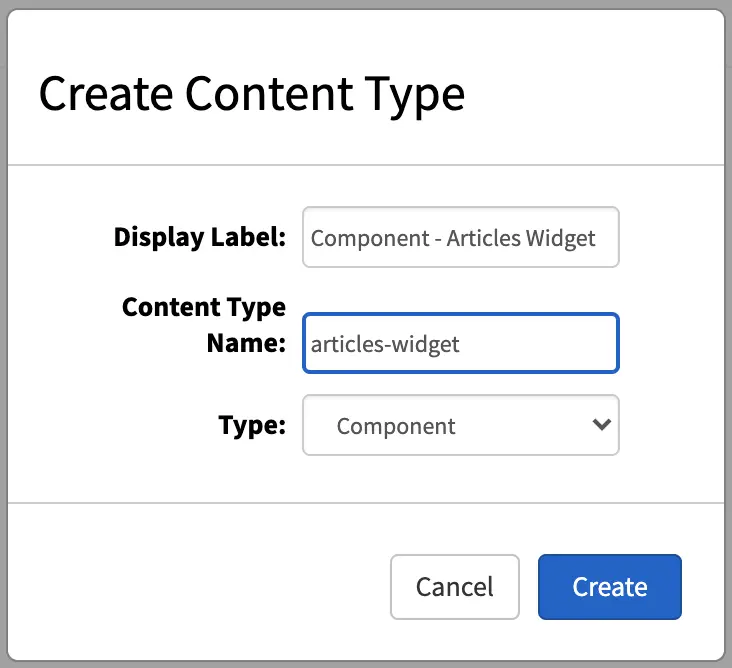
We’ll now show you how to construct the layout of our component. Just like a Page content type, a Component content type has three ingredients: the model, the view and the controller.
Model
The dialog that opens after clicking on the Create button is the form that is presented to authors to enter content into. The controls available are on the right side of the dialog, in the Controls section. Simply drag the desired control to the form section to add.
Let’s take a look at the model for the articles-widget component content type. The default dialog after clicking on the Create button contains only the Component ID and Internal Name field. From the image below, we have a few input controls added, one for the Title, one for Max Articles, a check box for Disable Component and an item selector for Controllers.
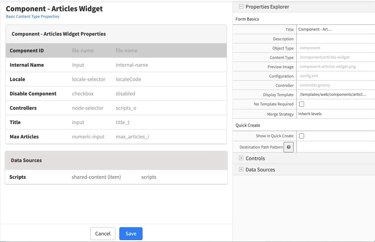
In the Data Sources section of the form, we see a shared content for Scripts, with the Repository Path property set to /scripts/components
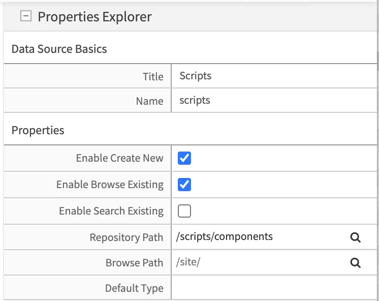
We’ll take a look at the property Controllers and notice that the data source Scripts is bound to the item selector Controllers by a check mark to Scripts for the Item Manager under the Properties Explorer of the Controller item selector control
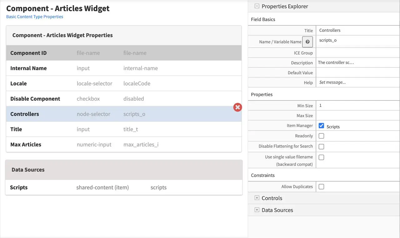
That’s the model for the component content type Articles - Widget. Remember that you can add some other controls by dragging and dropping controls from the Controls section to the form. To learn more about all the controls available, please see Form Controls. To learn more about the data sources available, please see Data Sources.
View
We’ll now look at the view for our template, which is the freemarker template file that renders the content, typically to HTML markup. There are two ways to create the freemarker template file for our template. One way is to open the Sidebar menu in Studio, then navigate to the Templates folder, depending on how your project is setup, you may want to navigate to the subfolder in your Templates folder where you want to create the freemarker template file. Once you are in the desired subfolder, right click on that folder then select Create Template. In our example here, we navigated to Templates->templates->components, then right click on the components folder then select Create Template
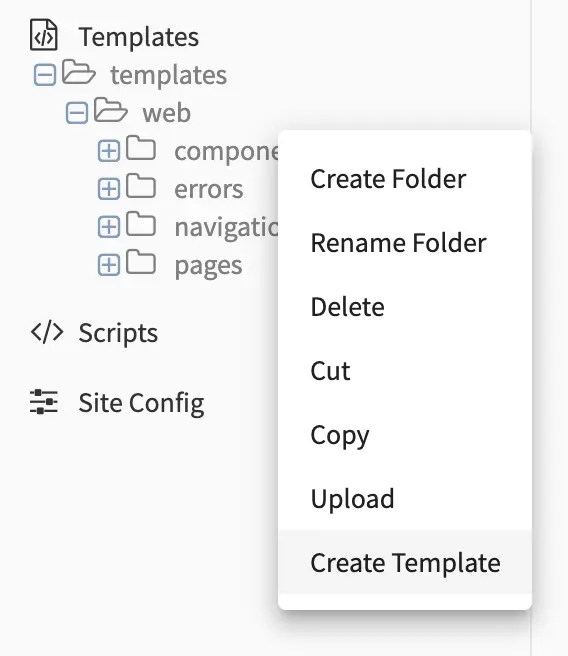
You’ll then be shown a dialog where you can give the view template a name, then click on Create and a dialog will open where you can enter how you want to display the content.
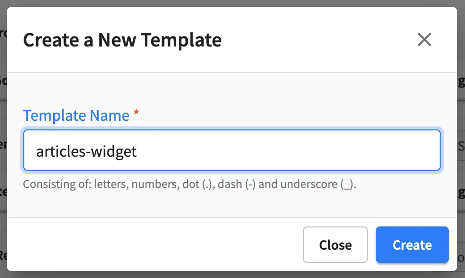
Here we’ll take a look at the view template for the component content type named articles-widget.ftl
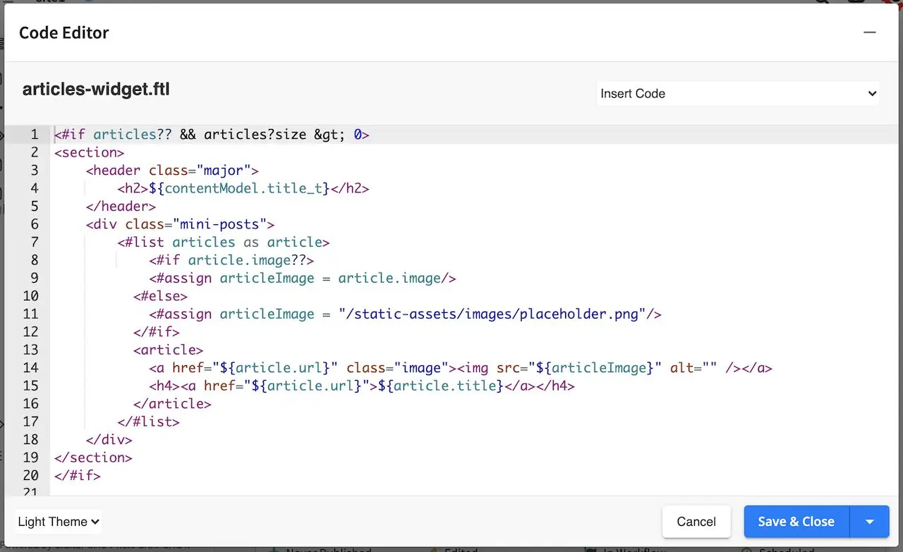
Let’s take a look on how to bind the view template to the model described earlier by clicking on the Display Template under the Properties Explorer in your model.
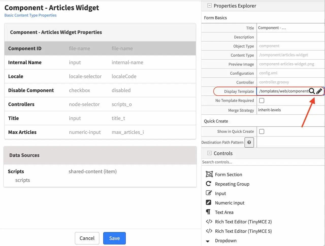
We will now select the view template we just created by clicking on the magnifying glass and selecting your desired template from the list. For our example, we would select articles-widget.ftl from the list.
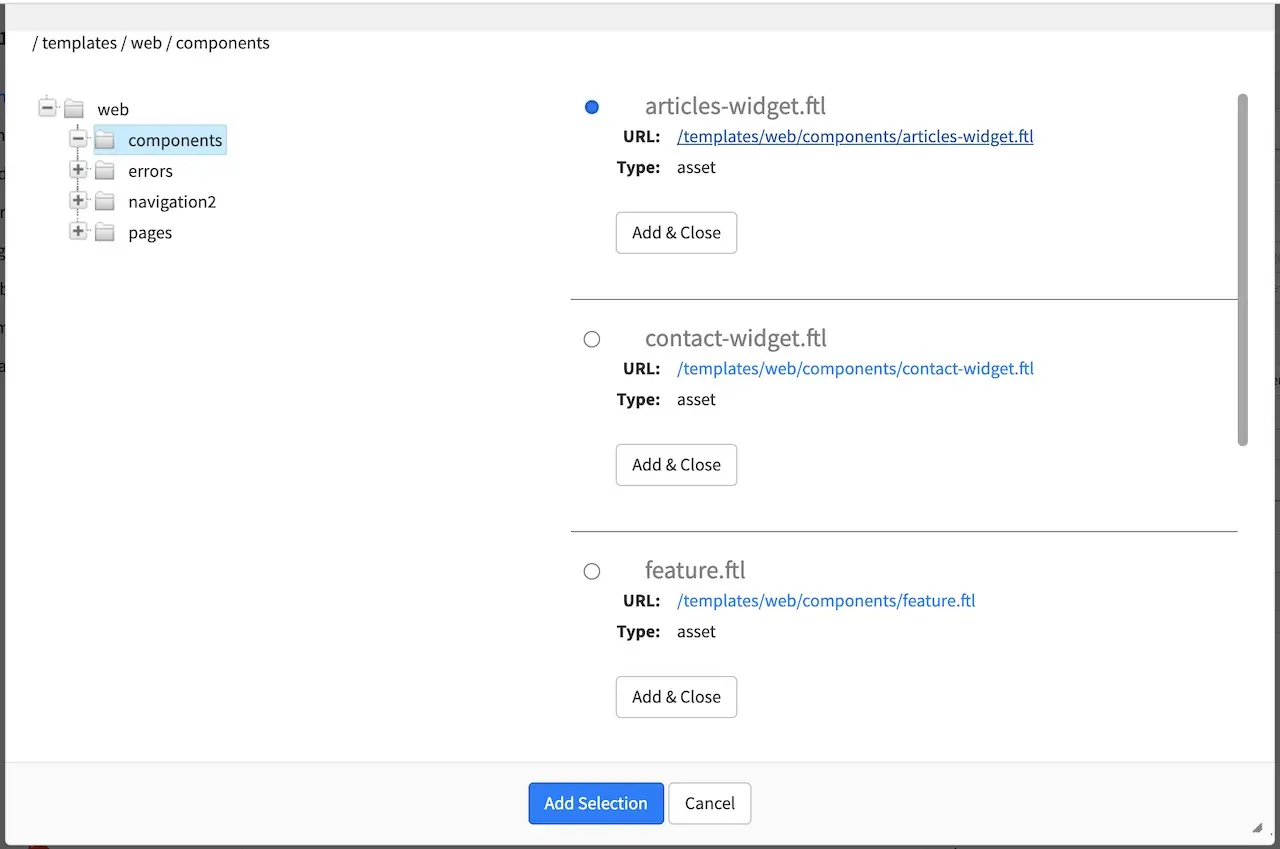
Our view template is now done. Next we’ll see how to create a controller for our component and bind it to the articles-widget component content type template.
Controller
We will look at a controller that allows us to display the latest article entries in the sidebar of our project.
There are two ways to bind a script/controller to a page/component. The first way, as we have seen in the previous section Page Content Type Example is to put the script under Scripts->Pages or Scripts->Components, and name the script after the page or component type. We’ll show the other way how to bind a script to a page/component in this section, by adding an item selector to the model with a corresponding data source Shared Content named scripts. When we were looking at the model for our content type template (articles-widget), you may have noticed that there is an item selector named Controllers with a corresponding data source shared content named Scripts, we are now going to look at a script that can be used by the item selector of our content type.
To create a new controller, open the Sidebar menu and navigate to the Scripts folder. Click on the Scripts folder then scripts. Right click on the folder components, then select Create Controller
Enter a name for the controller, then click on the Create button. For our latest articles example, this is how it would look like when giving your controller a name:
A dialog will then open where you can start entering your script. Let’s take a look at the script to get a list of the latest articles
1import org.craftercms.sites.editorial.SearchHelper
2import org.craftercms.sites.editorial.ProfileUtils
3
4def segment = ProfileUtils.getSegment(profile, siteItemService)
5def searchHelper = new SearchHelper(searchClient, urlTransformationService)
6def articles = searchHelper.searchArticles(false, null, segment, 0, 2)
7
8templateModel.articles = articles
After creating your controller, you would then need to create a component that will use the script just created. Let’s take a look at the component named Latest Articles Widget under the Components folder in the Sidebar which uses the script we looked at earlier. Preview your project or click on the Dashboard. Click on the Sidebar and navigate to Components -> components -> articles-widget. To create a new component, right click on the folder, then select New Content, which will open the form containing the model we looked at earlier for articles-widget:
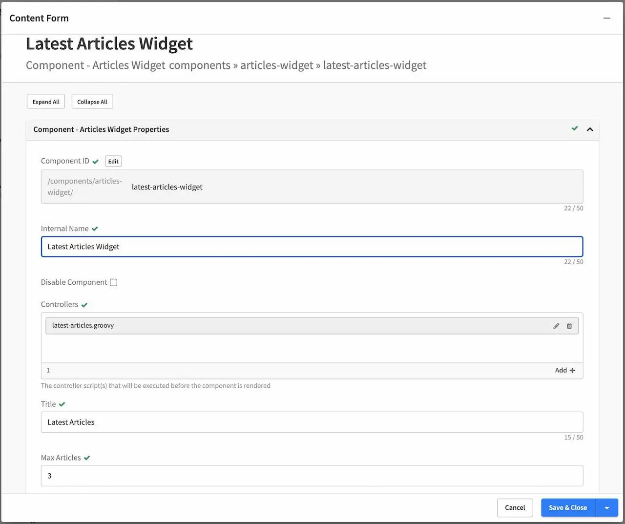
As we can see from the figure above, the script we created is bound to the new articles-widget component we created. To bind a script to your component, in the Controllers field, click on the Add button, then select Browse for Existing - Scripts, which would then give you a list of existing scripts:
The component is now ready to be used in the Sidebar.